MCP is starting to put in a strong intraday positive divergence (leading), I'll post it after it has had a little longer to show it's full size.
In the mean time I was just going to update short/intermediate charts and maybe some implied price targets, but I went a bit further.
3 min
1) we have an "in line" signal, no real divergences, price and 3C are confirming each other
2) is a small positive divegrence, it may have looked large at the time, but when compared to a much larger one it loses the impact, but it was enough to send MCP up on a stage 2 run and in to stage...
3) Which is a top/distribution and note the very volatile, seemingly bullish action, a parabolic or vertical ascent which forms the top, as always, price is deceptive.
4) We have a positive divergence that sends price higher in a mini stage 2 and 3 and finally stage 4 decline which is a small correction, at least it looks that way.
5) We have a huge leading positive divegrence, this is seen most often at the second bottom of something like a double bottom of "W" base, the second base sees even more accumulation which has accrued in to a stronger signal, so it is probably appropriate to view the entire area from #2 to #5 as one big base from looking at this chart alone.

A 5 min chart shows the exact same areas, in line, positive, a run up and negative divergence at the parabolic top where price "appears" to be the strongest, it's actually the weakest / breaking point to #4 which is a small corrective cycle and #5 , a stronger leading positive divegrence.
This confirms the chart above this one.

Intermediate 15 min chart which can be a very powerful timeframe in its own right shows something interesting, the first chart (3 min) suggested that we view the entire area as one larger base asre, when looking at a 15 min chart we see an in line status in green as price moves down and we see the divergences and the base areas they developed in that traces out a larger "W" base, there's only a small amount of distribution at that parabolic top in the middle because it's not true distribution, but it's letting out enough supply to cause MCP to drop back down to the accumulation range. For instance, imagine accumulating 500,000 shares at the first base which causes price to rise as the float becomes smaller (not the true float, but what is available for trade at the moment, those 500k shares are removed from the market by whoever is accumulating). This causes price to rise, the distribution to send MCP lower to finish filling out the order may have been something like 100k shares to knock it back down (
this is just for example, not meant to be real numbers), this leaves +400k accumulated and price back in the accumulation zone where another 600k may be added, giving an accumulated 1,000,000 shares and a stronger leading divergence. Now even more of the float is off the market, it takes less and less to drive the stock up as the float is reduced by the accumulator, simple supply/demand 101.
The longer term 60 min chart makes it clear that the "W" pattern we were looking at above is likely part of a much larger "W" base, the 15 min chart's "W" above would be the second base in a larger "W" stretching from #2 to #5 and the 15 min chart's "W" is #5 alone. The same concepts apply though as #3 is distributed to send prices lower to finish accumulation.
Now we can see there's likely a much bigger base,
notice how fractal all of the charts are, a small "W" making up one part of a larger "W" base and so on.
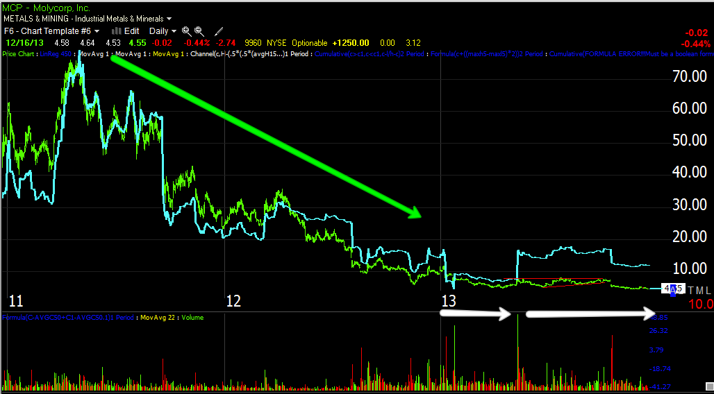
This is the daily chart, it definitely gives the same impression as the 60 min chart, this means the initial move to the upside will likely only be the start of a much larger move, the "W" here becomes clear at the white accumulation areas with the total base in the green box around the date scale.
Money Stream shows the same thing, in line as price moves down and transitioning to a positive divegrence, look closer.
This would be the same area seen in the longer term intraday charts.
If we use a simple price based, measured move which I think ois way too conservative for a base this long, we get...
Our regional base that likely moves to the 7+ area, which also is the area where shorts are squeezed as their stops are in the area from the GS downgrade. Once that squeeze begins, the larger base breakout implies a run to the $11+ area, but as I said, this measured move only accounts for price/bases from top to bottom, it doesn't count the length so it's likely very conservative in upside guidance.
MCP has long been one of my favorite LONG TERM long positions, I hope you can see why.


No comments:
Post a Comment