Friday, June 5, 2015

USO , Crude Futures, $USD charts...

Yesterday we closed the USO put position opened Monday Closing USO July 17th $20 Put Position to lock in gains of +45%, USO Follow Up. Here's yesterday afternoon's USO / Oil Analysis.

Today we have the bounce in the $USD (on the Jobs report) we had signals for, although I believe it to be very short term in nature, it pushed oil's earlier OPEC based gains back down when payrolls came out.

The daily chart is also looking a bit interesting... (Sorry for all the charts, but I want you to see what I'm seeing and my reasoning)...

 We have expected this downtrend since USO crossed above its base's resistance, but showed distribution there and failed to follow through. I still expect USO will finish up a larger base and at some point soon we'll be looking at a long term trend long on an oil reversal.

For now today's daily chart is showing a Thrusting Candle(bullish), similar to an engulfing candle. Should it either engulf or remain the same with higher volume than yesterday, it will be an exceptionally strong candlestick reversal signal.

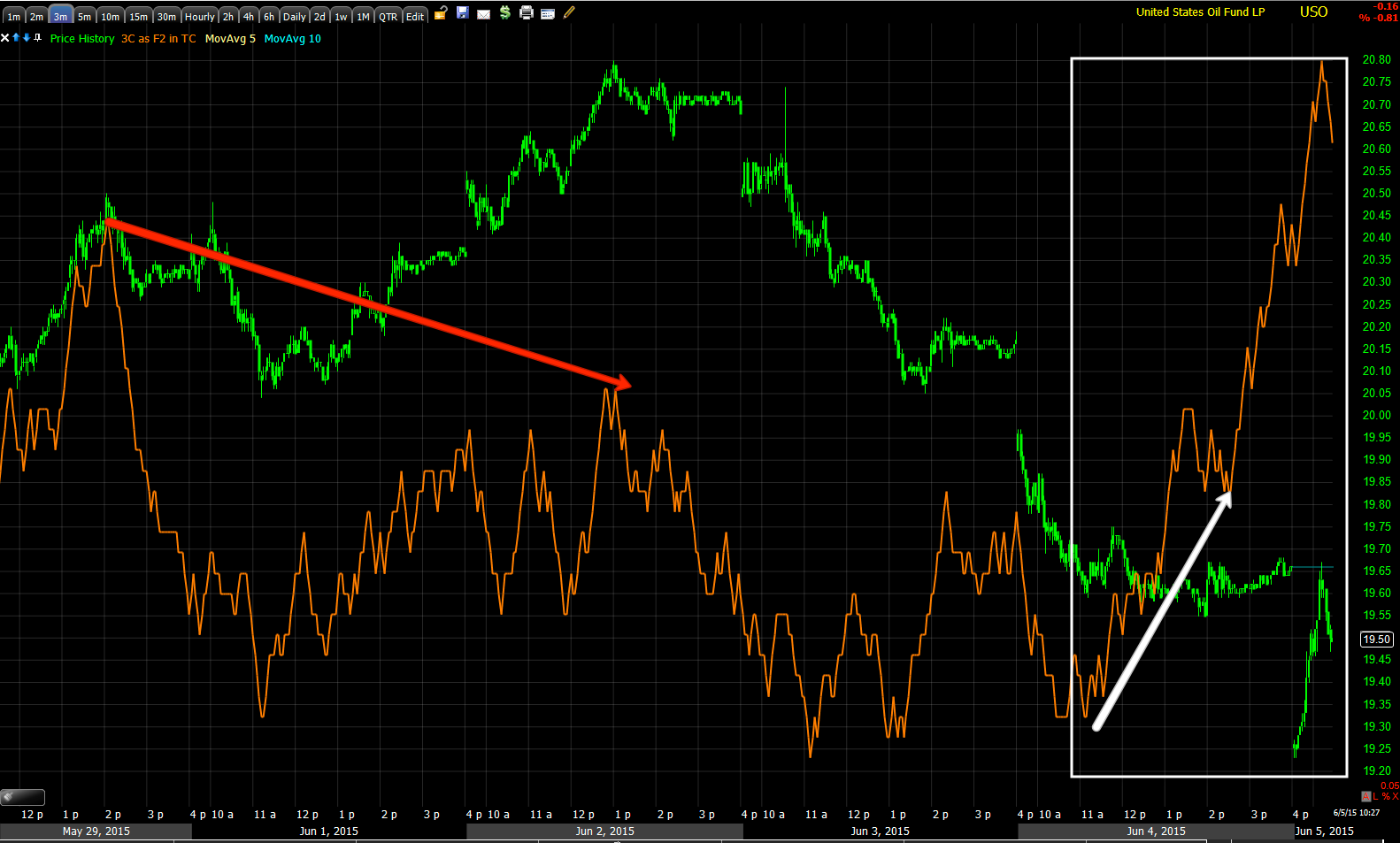
 As we saw yesterday, USO's short term intraday charts are showing positive divergence and improving like this 2 min

Or 3 min positive

Even a 5 min leading positive suggesting a decent near term bounce, not large enough that I'd want to play it without some leverage though.

Ultimately the 15 min chart still shows USO has more downside to go once this bounce is over and as soon as the put position was closed yesterday, it was always my intention to re-open it at a better price a bit higher so I expect after this we'll be moving to a new put position on the downside until the base is finished.

As for Crude Oil Futures (CL/Brent)
 The 5 min shows the same negative from earlier in the week that caused us to open the put position as well as the positive started yesterday and in to today.

Luckily oil, unlike stocks recently, still has some tradable volatility.

 The CL 7 min chart also confirms.

As does the 10 min

And the 15 min chart.

As for the $USD which we expected to bounce today and it did as expected based on its signals. Whether that means the Payrolls data was leaked or not I can't say, but it responded the way it should have on the Payrolls data and the divergence for a move higher was in place well before the Payrolls came out this morning.

 5 min $USD shows the positive from yesterday and today's move, but there's no confirmation of today's upside, thus I don't believe it holds very long before heading back down, which helps USO/oil move higher.

 This longer term 7 min chart was already positive and in place, the 5 min divergence which is faster to develop hasn't made it to the 7 min chart as of the time I captured these, but when it does, I'd expect the $USD to head lower and continue retreating from its counter trend rally that is now over.

 The 7 min Euro chart shows a confirming divergence yesterday (negative) as the two move opposite (USD v Euro).

 This is the trend we have forecasted in $USD since April 2nd when we called for a bounce which started its base to the far left at April 5th, we also called for that bounce to fail and a much larger downtrend to take over which occurred.

Shortly after we called for a large counter trend bounce/rally and a strong one as they usually are. the $USD made the strongest 7 day move in over 7 years at the long yellow arrow and we called the reversal to the downside which is well in place even with today's short term bounce. As the $USD moves lower, it should push crude higher.

This is the daily $USD chart I pointed out last night/yesterday with a bullish hammer reversal candle and today's gain, however these don't tell us anything about how long of a reversal.

This is the 4 hour chart of Crude futures with a large base almost fully formed for an upside reversal so while I see a near term bounce in crude, ultimately it should be heading back inside the base as the red signal to the right shows, finish up building the base and we should then have a viable reversal to the upside in oil.

For now, 1 bridge at a time.

Trade Idea: USO (Speculative)

As you know from yesterday the USO put position was closed as it looked likely we'd be seeing a counter trend bounce, I think that's still likely, but we have some better looking charts.

The USO equity short (meant as a longer term trend trade) will be left in place, but I'll be opening some USO calls, July 17th $20 calls at about half size to reflect the speculative nature of the position.

I still expect USO will move lower, however in the near term with the $USD sitting the way it is, I suspect it gives oil a short term boost upon the decline of the $USD bounce we were looking for today.

I'll have charts u[p in just a few minutes of USO, crude futures and the $USD.

What High Yield credit is Screaming

I've talked a lot recently about the sharp demise in High Yield Corporate Credit. Without going in to a long history go why this particular risk on , institutional asset is so important, I'll just try to give you a brief explanation.

Institutional money , smart money, whatever you want to call them trade credit, this is not typically an asset that retail traders would trade and most haven't even heard of it or have any idea why its important. Before the financial crisis, organizations could go to banks and borrow a wide basket of credit products and trade them, but in the Financial crisis many banks sold off their credit exposure making it difficult to put together a diversified, but more importantly LIQUID way to trade credit. Thus the creation of a diversified HY Corp. credit asset that is an easy, liquid way to trade credit, HYG is one of the biggies, although there are others.

Typically you have 2 types of credit classes , broadly speaking, the safe haven Investment Grade Credit which might be considered similar to Treasuries when traders are concerned about the market , they rotate out of stocks and in to the "Flight to safety" trade of treasuries, that's not so much the situation presently for unique reasons to this particular market (much of it having to do with liquidity of treasuries as the F_E_D soaked up a ton of supply during QE and the carry trade). The other type would be the "Risk On" High Yield Credit, more akin to a momentum stock.

There are a few services out there such as Capital Context that make their models using High Yield Credit as it is that important. For our own part, it's one of our most important leading indicators and has been excellent at telling us when it looks like they are getting ready to push the market higher and when they are running for cover.

I mentioned earlier that Credit has taken a sharp turn for the worse vs the SPX. If all things were equal in a healthy market , theoretically HY Credit and the averages would move in similar fashion so like Dow theory in a way, the confirmation or non-confirmation of Industrials vs. Transports which have fallen apart as you can see below...
 Dow Industrials (Dow-30) in green vs. Dow Transports (Dow-20) in blue and below a custom indicator I created so you can see the difference in performance as Transports use to be a momentum group and outperformed the Industrials to the left, but have fallen out of bed completely and are now badly laying (below the zero line on the histogram).

Looking at HY Credit vs. the SPX/market can also tell us a lot and is a lot less dated that Dow Theory above.

I often say that the first lever the invisible hand of market manipulation will pull to ramp the market is High Yield corp. Credit and we'll often see that in 3C before we see the price move in HYG. Below are some charts of HYG through various 3C timeframes, remember the shorter term ones are the weakest, but most likely to occur first and the longer term ones show the longer underlying history/trend of whether they have been accumulated or distributed.

The 1 min HYG chart has a small positive divergence, quite similar to the one in the SPY... Or rather I should say the one that was building earlier in the SPY since yesterday- there's some question in my mind right now as to its health, but I'll update that again later.

However, I did show a 1-day oversold condition last night and in the last post I covered it again. I also showed some of our watch list possible trades like NFLX are moving as we expected and hoped for an entry, again see the last post.

I'm not sure how the SPX/SPY will close, but as of the last capture, here's the daily chart...
Daily SPY chart. When the SPY tried to break above the flag I showed you and mentioned it needed to hold $212.50 (Yellow Box) to be an upside catalyst to finish the head fake move I had been expecting (the Igloo/Chimney price pattern which a member pointed out this morning is taking shape in JPM). It failed and from these failed breakouts (a form of head fake move), come fairly fast reversals as we saw in the SPY creating a 1-day oversold condition in the market's breadth yesterday- see the "Internals" section of last night's Daily Wrap. Note the bearish candle and the high volume, although it was actual individual groups/sectors and stocks that provided the 1-day oversold condition signal.

Today's candle is a loss of downside momentum with a "fat" star. If volume can close higher or reasonably high, this gives it a decent chance to create an oversold bounce and this "may" get our watch list shorts in to position, although it seems many are not waiting for the market and are doing it themselves.

Back to HY Credit... the point is, this very short term and weak 3C positive 1 min HYG signal would be the kind of thing we'd expect to see if the market were going to try to finally get this bounce underway- a bounce that would fail, but give us the opportunities we have been looking for. Again, I refer you to the NFLX Trade Set-Up not because it is unique, but because it is representative of many of the assets we are looking at and letting the trade come to us.

 Like the SPY, the 2 min HYG chart has no such positive divergence. It's very weak to see a 1 min chart positive for a day and not have migrated to a stronger timeframe of only 2 mins. In other words, any bounce condition in the market or HYG as a lever to help, is very weak, which is not to say it won't or can't bounce, indeed that's what the signals are pointing at, just not a bounce that will hold which is exactly what we want to see for our new position entries.

 The 3 min HYG chart is in line or confirming the downside price trend.

 As is the 10 min HYG chart, although this is a much stronger time frame with stronger underlying flows.

 And HYG's 15 min chart at a new leading negative 3C low and price low for the chart.

Take a look at the same chart without any distractions on it...
 HYG 15 min has been in horrible shape.

The HYG 30 min which has also been in horrible shape with divergences just pointing to a move lower which has taken place and will continue to move lower over weeks and months ahead.

 Finally the strongest 3C chart of HYG, the daily. Look at how bad the 3C signals turn right around the larger red box and note 3C at a new leading negative low on the strongest daily chart signal.

Again, the same daily chart with no distractions on it.

You may have noticed we often work from reverse, long term to shorter term as the longer term charts represent the trend of underlying accumulation or distribution and the shorter term charts represent the timing of when the long term chart's projections of a break are ready to take place.

Comparing HYG (blue) to SPX (green), the only real important thing to the market is NOT the 3C signal, ONLY WE SEE THAT, it's HY Credits position vs the market. Like Dow Theory with Industrials and transports, is smart money confirming what the market is showing or is it diverging?
 Again, starting from the long end or STRATEGIC charts, this daily HYG vs SPX shows that it was in line for a while at the green arrow and then HYG went on to make a series of lower highs (red) and lower lows (yellow) and is in a primary downtrend, FAR from confirming the market. I expect HYG to make a new lower low next.

 As for the medium term charts, You can see how HYG is used to ramp the market as the SPX follows it nearly in lock-step , but recently HYG has fallen off and is diverging with the market. This is more of a tactical basis.

And much shorter term you se the deterioration in HYG's trend long before it completely dislocates from the SPX. Again, the long term strategic charts are pointing to the highest probability resolution and the shorter term tactical charts are pointing toward the best position timing.

As it stands RIGHT NOW, it looks like HYG will give brief support to the market as long as it can which shouldn't be long at all, maybe enough to get off a small, normal counter trend bounce or correction on the 1-day oversold condition in place. However after that, everything is screaming DOWN for the market.

We want to use ANY price strength we can get to sell long positions and/or enter short positions if you haven't already or add to them.

High Yield Credit is telling us a lot if you listen. Remember this post in subsequent market updates.

Early Indications-Multiple Asset Update

Here's an early look at what I expect from some key assets we are following. After this I'll likely be spending a good portion of the day looking at our watch list shorts and seeing if any are nearing a reasonable entry. I do not think the market will respond well to the jobs number after options expiration is over, it increases the chance of a June rate hike @ the next F_O_M_C meeting which is coming up mid-month. That being said, a weak bounce has looked likely, especially since yesterday's 1-day oversold condition. I should say weak as in the underlying position of the charts and the lack of 3C support.

For today, yesterday's sharp internals suggested a 1-day oversold event and a probable close in the green today, this "may" be a bit longer than 1-day, but I don't expect much longer if at all which we'll see later today as the charts further develop. From last night's Daily Wrap in internals and their next day reaction...

Although the Dominant Price/Volume Relationship was mixed...

"Tonight the Dominant Price/Volume Relationship is mixed. The NASDAQ didn't have one. The Dow and SPX were both Close Down/Volume Up,  with 22 and 249 stocks respectively. This is a 1-day oversold condition and usually sees a green close the following day. "

Much more importantly were sector performance indications suggested clearly a 1-day oversold condition (this is not the same as indicators' oversold, but based on breadth which is much more reliable)...

"Interestingly at the same time, 9 of 9 S&P sectors were in the red, Energy led to the downside. Among the Morningstar groups ONLY 14 OF 238 SOTCKS CLOSED GREEN. THIS IS AN EXTREMELY DEEP 1-DAY OVERSOLD CONDITION. ALL IN ALL, JUDGING BY INTERNALS ALONE, I'D EXPECT A 1-DAY BOUNCE OR A GREEN CLOSE TOMORROW."

In addition we have options expiration.

This is my initial take on what I'm seeing this morning (some of the short term 1 min charts may be already a little untimely, but still have a point to make).

As was seen and noted in the A.M. Update, 

" ES knee jerked lower, but looks ready for an intraday move higher."

So far, along with 1-day oversold internals, yesterday's 1 min positive and this morning's positives in Index futures...
 ES 1 min positive divergence as seen this morning after the payrolls data. The payrolls data won't be taken well by the market, which is one of several reasons including op-ex and the 1-day oversold condition from yesterday, that I expect it to bounce a bit which should open some short positions on our watch list, although we may need to wait until the op-ex pin wears off later this afternoon or early next week.

 NQ 1 min positive divergence this morning as well.

Since yesterday we have had this 1 min positive in the SPY, but it has not showed strength and migrated, made a larger base or divergence in the next longest timeframes, VERY MUCH INDICATIVE OF THE 1-DAY OVERSOLD CONDITION FROM YESTERDAY'S INTERNALS.

 SPY 2 min shows no migration of the divergence, thus suggesting a very short term, oversold bounce likely or move toward an op-ex pin. This is what I mean in saying that there's not much support here at all, a very small base from yesterday and a very weak divergence combined with a 1-day oversold condition. 

 However since the last bit of accumulation on May 6th and 7th, the SPY has not responded well at all.

The 2 min QQQ is in a similar position as the SPY, a short term, small 2 min positive divergence...

At the next timeframe of 3 mins, no positive migration or strengthening of the divergence.

This is why I chose UVXY (2x long VIX short term futures) yesterday rather than VXX calls, Trade Idea: VXX / UVXY Long , it gives me some leverage and some room on the wild card/unknown (as of yesterday) event of payrolls, but still allows me to hold the position without too much draw down in to next week where the market is shaping up to get even uglier.

 For instance, like the SPY troubles seen above on the 3 min trend, the QQQ 5 min trend is showing the same negative disposition in more important timeframes and through the last bounce from early May as the rounding top has taken full shape.

As for Treasuries/TLT... As you know I'm expecting a strong counter trend move once they wrap up their base/reversal process which I believe is nearly done. Remember we just closed TLT puts earlier this week for a near 40% gain on a short term trade, the reason why is I believe the larger counter trend bounce base was about to be finished up and so far it looks like that was the right call.
 TLT 1 min trend since out short term put position expecting a short term move lower.

The TLT 3 min chart's trend is much more clear, from our short term puts and negative divergence to the base-building positive divergence now.

 This TLT 10 min chart shows what appears to be 2 different bases, I believe they are one larger base with the break below TLT's long term trend line (Channel Buster) at the two red boxes on the 6th and 11th. Note the positive accumulation toward the low end of the base range.

As for oil, I closed USO's short term put position yesterday for a 40+% gain expecting it to see a short term bounce in which I'd like to open a new put position...
 The 2 min USO chart shows where it was negative and why we had open put positions and where it has turned very near term positive on the chart since closing the put yesterday.

Again the USO 3 min chart shows the same, the probability of a near term bounce allowing us to lock in yesterday's put gains and enter a new position at a better price with le
As USO's longer term 15 min chart still reflects more downside for USO before it is ready to finish up its longer term base.


As for the watch list assets/trade set-ups like the recent NFLX Trade Set-Up,  many, like NFLX, are moving in the right direction for the trade set-ups I was looking for and hoping we'd see before the market sees too much damage and downside.

 A break above this range was a prerequisite and part of the NFLX Trade Set-Up posted, today it is in the area and should soon be setting up that short position, one of many that are in a similar position, which is why I want to spend some time today checking up on the watch lists as the op-ex Fridays tend to be rather dull until the last 2 hours of the day.

NFLX's short term 1 min chart suggests it will move toward our short area, letting the trade come to us as the broader market and watch list charts are in bad condition.

For now I'll continue to hold UVXY long, I suspected some near term volatility and the UVXY long rather than VXX calls allows me to better weather that near term volatility, but still have a position in place and be prepared in case Payrolls went the other way and as you can probably tell, I am feeling pretty good about the market falling apart very soon, hopefully not too soon that we can't get off our new short positions like the NFLX example as we need the trade to come to us for the best entry, lowest risk and best timing.

So far we aren't far off from the projections posted this week and specifically yesterday.

Remember, one of the worst looking charts for the market is HYG's (High Yield Credit) leading dislocation in price vs the SPX, this is already on long term primary charts, intermediate charts and now shorter term timing charts.

HYG (red) vs the daily SPX (green), this dislocation is very serious considering how badly longer term HYG charts are already dislocated from the market to the downside.


A.M. Update

Good morning. Other than a tame 1.5% gain in the Shanghai Comp compared to recent action that sent it above 5k for the first time since 2009, Asia was rather dull. Europe isn't looking great right now with a cool deal of the markets down nearly 1%.

As you likely know, OPEC left production unchanged at 30 mm bbl a day, this sent crude higher as we have expected a bounce from the charts...
 However at 8:30 Non-Farm payrolls beat at 280k, well above the 226k consensus expected sending the $USD higher as we also expected at 8:30, which sent oil lower at 8:30.

We'll se what it looks like in the cash market.

 This is the USD on the better than expected jobs report, which seems to give Yellen the go-ahead with a June rate hike as not only did jobs beat, but wages came in stronger than expected suggesting the "slack" in the labor market is tightening.

Everything else sold off on the knee jerk reaction including equities, bonds, commodities, oil, gold, etc.

As also expected, the EUR/USD came down (see to the far right on this 16 min chart).

 ES knee jerked lower, but looks ready for an intraday move higher.

And Treasuries which we are watching for signs of a short term bottom knee jerked lower on the jobs print, but also have an intraday positive divergence suggesting a move higher.

Really none of this matters too much until we see what the cash market does and that may take a little time considering it's an  options expiration Friday.

I'll let you know as soon as I see it.