Thursday, October 4, 2012

Market Update-SPX

I'm really trying to gather as much data as I can here as this is more than just about quick trades, this is about the future direction of the market which has always been very handy information to have before hand.

First I just want to go through the SPY with you, right now we aren't seeing any movement in price, but there are underlying trends that are moving (like the futures, so far they seem more risk off) and while some timeframes may not seem useful, I think it is useful to see what the market has been thinking about itself (Sounds like something Jack Sparrow would say).

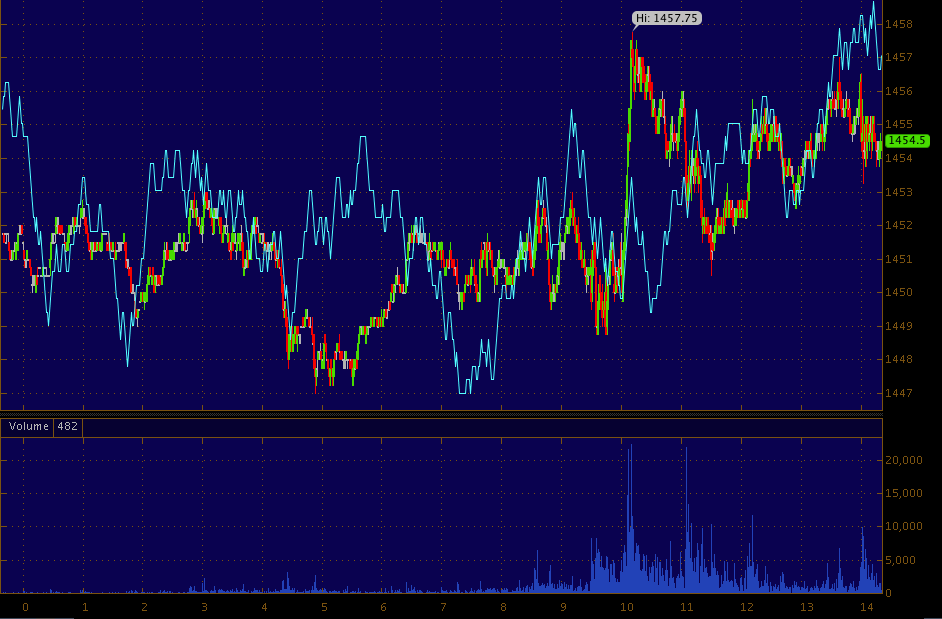
 While the 1 min trend isn't scaled perfectly (it can't because it's lower than price), the intraday movement has been almost exactly the same as price, this would suggest that this triangle was a true indecision price pattern, while it's hard to believe someone somewhere didn't have an inside line, there's nothing on this chart that points to that. OR... The F_O_M_C _ policy sounded a little confusing in moving forward so the market is a little confused in not knowing what exactly they are going to do, the market doesn't like uncertainty and the F_E_D sounds like they want to remove certainty from an actual date that the market can COUNT on to Macro Economic data that the market is clueless about, and once again as was pointed out as a potential pitfall of QE3, although not specifically as I couldn't have known, I mentioned the inflation/policy question that topped the market out when Bernie spoke to reporters on the 13th. That was uncertainty, "if inflation rises, the F_E_D could alter the QE program", this sounds like even greater uncertainty although it is spun to be the opposite.


 I zoomed in the 2 min chart to scale it to the price action, you can see it was nearly in perfect sync.

 This is about where the 3 min trend belongs so it didn't confirm today, but roughly moved with price intraday.

 The 5 min chart was where the weakness has been today, I mentioned I'd be watching the 10 min chart for any migration...

 There is a little starting here.

Now it's the 15 min chart in line and watching to see if there's continues negative divergence migration across the 10 min and in to the 15 min. If so, I want to be looking at shorting on strength a bit more aggressively.

SPX and NDX Futures

This both shows the weird confusion in underlying trade I've mentioned this week, as well as the hesitation before the minutes and seems to be showing some risk off sentiment developing.

S&P Futures - ES
 1 min is sticking very close to price, no big divergences.

 ES 5 min seems to be in risk off mode as 3C falls.

 ES 15 min hasn't had much of a trend recently here, today it is looking much more like risk off.

NASDAQ Futures
 1 min sticking very close to trade.

 As is the 5 min

Look at the chop in the 15 min in recent days, today the move is a bit more clear and it looks like risk off.

The Bullet Points


  • *FOMC PARTICIPANTS SAW `SIGNIFICANT DOWNSIDE RISKS' TO GROWTH
  • *FOMC PARTICIPANTS SAW `PERSISTENT HEADWINDS' TO RECOVERY
  • *FOMC PARTICIPANTS SAW FISCAL POLICY AS A `DRAG' ON ECONOMY
  • *FOMC PARTICIPANTS SAID HOUSING MARKET IMPEDING RECOVERY
  • *FED OFFICIALS SAW MANAGEABLE BOND BUYING RISKS, MINUTES SHOW
Maybe more interesting...

A number of participants questioned the effectiveness of continuing to use a calendar date to provide forward guidance, noting that a change in the calendar date might be interpreted pessimistically as a downgrade of the Committee’s economic outlook rather than as conveying the Committee’s   determination to support the economic recovery. If the public interpreted the statement pessimistically, consumer and business confidence could fall rather than rise.

Many participants indicated a preference for replacing the calendar date with language describing the economic factors that the Committee would consider in deciding to raise its target for thefederal funds rate. Participants discussed the benefits of such an approach, including the  potential for enhanced effectiveness of policy through greater clarity regarding the Committee’s future behavior. That approach could also bolster the stimulus provided by the System’s holdings of longer-term securities. It was noted that forward guidance along these lines would allow market expectations regarding the federal funds rate to adjust automatically in response to incoming data on the economy.


Read the last sentence, that is just what was posted about QE being priced in and it being the economic data that moves the market!!! 

It sounds like they are going to be experimenting with some different methods, perhaps disturbing to the market was the fate of TWIST.

I have to read the entire minutes later, but on the face of it it seems many of the "potential pitfalls" mentioned about QE3 were mentioned in some form or fashion.


GLD Still looks uncomfortable

I'm not big on making rash decisions right after a F_E_D statement, especially that one which we'll look at closer, but GLD still seems to be in risk off mode and this is one asset very sensitive to this kind of data.


Visual pre-F_O_M_C

Just to compare, the SPY

 The 5 min damage mentioned earlier.

1 min in a holding pattern.

Several stocks seeing intraday weakness like IBM, GOOGon the charts

I don't think they know-GLD

Right in front of the minute, there's definitely some nervousness in Gold and bond traders who are pretty smart cookies aren't happy today after the ECB did what was expected of them, virtually nothing. Spain and Italy are both moved much wider on the day.

As for GLD...

Here's one of Goldman Sachs analysts saying QE3 was priced in and the only way the market moves north is for actual improvement in the macro data. It's almost as if there's a reset, if inded QE3 is priced in as he's argued, then the market is back to simply looking at the macro data.

e
Q. Have equity markets already “paid” for QE3?

In short, yes. In the past, equity returns have typically increased following QE announcements, with the S&P 500 rising by an average of around 5% in the 30 days after announcements. But the equity market performance since the QE3 announcement appears to be running short of that. Perhaps markets have learnt from history-a unique feature of the QE3 announcement was that equity markets already climbed sharply into the announcement day itself, despite tepid macro data. But history also suggests that equities could make further progress as long as the macro data surprise to the upside. There have been two prior instances when equity markets gained materially in the 30 days following the easing action after having already risen into the announcement itself (round 1 of QE1 and QE2), with the macro data beating expectations following the easing announcements in both cases. We likely need to see similar improvements in the cyclical data now as well to see another leg higher in markets.

Risk Asset Layout

You may recall this week me saying the market seems very split, we even had to look at some indicators we don't usually use for market direction like Credit on Tuesday, the Euro yesterday, etc.

In looking at the Risk Asset Layout today, nearly the same identical thing, credit for the most part like HYG, except High Yield (which is weaker than the SPX) is in line, almost all of the risk asset indicators have moved to a neutral/inline stance.

It seems these minutes are very important and has the market on edge waiting to see what's in them.

The whole market is in a triangle awaiting the F_O_M_C minutes

Those negative divergences put the market in to a consolidation as it waits for the F_O_M_C minutes out at 2 p.m., remember the knee-jerk reaction that we almost always see with anything F_E_D related.

SPY triangle, this will probably grow a bit. The DIA and QQQ have the same triangle, the IWM is not so well defined.

This is what I'd call a wild card event, Technical Analysis will expect the triangles to break to the upside, what actually happens, I have no idea unless we can find what looks like a leak, that's what I'll be looking for and still you won't know which way it will break (although I'd say chances are better for at least a knee jerk break to the upside. The point being, if we can find a leak before hand, we know we can pull off some trades in to whichever way it breaks, otherwise we have to see what the underlying trade is telling us as the move occurs.

For the most part the averages are still weak on the 5 min charts, but improving on the 1 min which probably  is a big enough divergence to halt the market's upside from earlier and some support now to keep it in place rather than let it fall-adjustments. The other possibility is that 5 min chart being negative is part of the sign we're looking for, if it migrates to longer charts it almost certainly is. In that case, we'd most likely be looking to short any strength out of the minutes.

I'll get back with you ASAP on anything I find.

CAT

CAT didn't pullback as far as I had hoped in last night's post, but we had at least one member on it early today who went in and out for a nice profit.

CAT looks like it's going to pullback a bit or at least consolidate in this area. If I were interested in playing it, I'd probably try a phased entry with a partial position in this area and leave a wide enough stop (position sizing) to be able to add around $85.50, I'm not sure we'll get much more than that. In any case, the positive demeanor I noted in yesterday's post is still there and it looks like it still has plenty of upside in it.

 2 min intraday CAT already pulled back from this small second top.

 The 3 min chart also negative intraday here

 And the 5 min chart is even deeper in to a leading negative divergence now so a pullback seems most probable.

 The more important 10 min and 15 min above and below show the positive position CAT is in and why it looks like it has a decent move up coming.


Even the 60 min chart looks good.

If CAT will come to you, the risk is already fairly low with stop in the high $81 area.

Market Charts

It's still relatively early in the day to be predicting the close, but this action doesn't look very good in the averages.

 DIA out to 5 min leading negative

 15 min is even not quite at confirmation.

 The 30 min chart is. I have to wonder if this is just some near term pullback or if we keep moving through the timeframes with this negative stance on the shorter timeframes.

 QQQ 5 min leading negative pretty bad for half a day of trade.

 The 30 min chart is still in line.

 SPY 3 min leading negative

The 10 min chart is almost in line, a little weakness on that last move up intraday