Monday, June 9, 2014

More Pros Moving Out

You probably remember the post 3C Distribution Confirmed by BofAML. I've put out quite a few maps of what we were looking for since mid-May and what came about since then, we were looking for a move above this range with strong distribution as it's just a high probability concept (more than 80% of the time) and with a range that's 3 months long in the most watched Index/ETF in the world, the probabilities go up exponentially.
In white is the bear flag we found in mid-May, shortly after I had thought this market would not move below the range with a range this large until there was a break above the range and there was solid distribution in to that break, in essence a head-fkae/short squeeze. The bear flag was instrumental in getting that kick-started via a Crazy Ivan shakeout which is what we had forecasted, the short squeeze took over in to 1900.

We saw the distribution we expected to see as this move is designed to create demand, force short squeezes which is also what we were able to confirm.
SPY 30 min not only shows YTD (and longer) distribution, but specifically above the range area, the same area BAC shows Institutional money net sellers and retail net buyers.
 Even this other Money-Flow indicator that I ran across which caught my attention because it looked so similar to our own charts...

More on this chart found here, Broad Market Update

So we have the broad concept which predicted the move and how it would happen weeks before, we have the distribution in 3C we were looking for, the confirmation of institutional new selling from B0fAML not only for the immediate time period, but on a much longer basis as seen in this chart and this post, 3C Distribution Confirmed by BofAML

Note the long term and especially short term trajectory of Institutional vs. Retail net sellers/buyers.

You may also recall last week, F_E_D Correlation , that if you extrapolate the SPX's correlation to the F_E_D's balance sheet expansion to the end of the taper, the SPX has already met that target well before the F_E_D got there, I suggested that this is the market front running the F_E_D as it usually does and the 25 to 30 SPX (points) premium above the balance sheet is also being confirmed in the ES CONTEXT model and is likely a result of not only the pricing in which would have been just slightly above the 3 month range, but a head fake move as well that is needed as Wall St. can't make money in a zero sum game with everyone on the same side of the boat.

Here's what the SPX's front running of the F_E_D looks like...
Using Rate of Change on the F_E_D's Balance Sheet expansion (blue) and ROC on the SPX , you can see the SPX front ran the F_E_D every time. However right now, both are essentially at the same place. It's my contention that the market will front-run the end of QE as it is the only thing that has pushed the market higher thanks in large part to about a $4trillion dollar balance sheet expansion with much of that ending up in the market in what I believe was a stealth bank bailout because we all remember how happy the public was with the GM and AIG bailouts, but POMO/QE, that's above the public's head.

I made the case here, F_E_D Correlation

And now we have Goldman confirming the exact same...

Goldman Sach's Dave Kostin:

"While many investors puzzle over the decline in 10-year US Treasury yields to 2.6% alongside the S&P 500 at an all-time high, recent data suggest they moved flows in the same direction. Mutual fund, futures, and ETF data show a shift away from stocks and towards bonds during the past month. Pension funds have also sold stocks and bought bonds in 1Q. Equity market performance supports a pro-risk stance offset by a muted return outlook given high current valuations."

and...

"Institutional investors have also reduced exposure to US equities. Net equity futures positions of Institutional and Levered Funds have declined to $68 bn at the end of May from $92 billion at the start of April "
 
Specifically, "recent data suggest they moved flows in the same direction. Mutual fund, futures, and ETF data show a shift away from stocks and towards bonds during the past month. Pension funds have also sold stocks and bought bonds in 1Q"

This is not only in May, but through Q1, which is what I suggested with this chart...

Treasuries (TLT) in blue are moving up with the SPX, that's not suppose to happen, it's a risk on event ion the SOPX which is really nothing more than a short squeeze and a "Flight to Safety" event in Treasuries.

As many puzzle over rising bonds, falling yields and a rising SPX, I don't think there's any disparity there. All of the above suggests professional distribution. As Kostin notes, Mutuals, Hedgies, Pension funds have all been net sellers, Distribution through all of MAy and all of Q1, Bank of America goes further back to year to date.

How can both Treasuries and the market rise at the same time? More specifically right now with the SPX at an all time high and VIX at lows not seen since 2007, all of the above whether 3C, someone else's money-flow indicator showing the same, BAC's trade data showing the same and now Goldman coming out with the same, would all confirm professional selling as well as our leading indicators which can be seen here (the most recent charts), Broad Market Update, simply...

The money coming out of risk assets (stocks) and when I say coming out, short selling prints as a sale no different than a sale so there's no distinguishing them, has to go somewhere, it's moving in to treasuries and sending yields to ridiculously low levels. Either the market thinks the F_E_D will hike rates a lot sooner than they have been letting on, or the professionals would rather take next to nothing for a yield and get the heck out of equities.

Again, I think the SPX's richness to CONTEXT and to the F_E_D's balance sheet expansion when extrapolated all the way out to the end of QE3, is about one thing, that would be this head fake move...
These moves have to be convincing, how else could that many pros sell that much inventory without crashing the market? However, the entire reason we predicted this move in Mid-May was because we see the concept of a head fake in every asset and every time frame at least 80+% of the time, with a range this clear and the SPY as the asset, the probabilities go beyond 90%, that's why we were looking at hitch-hiking longs in Mid-May as I posted (the original post from that period) last week.

As I said Friday, I'm looking for more of a stair step decline likely this week, I don't think shorts will be eager to jump in, that is until we cross in to and under the range, that's where I think it gets very dangerous on the downside.
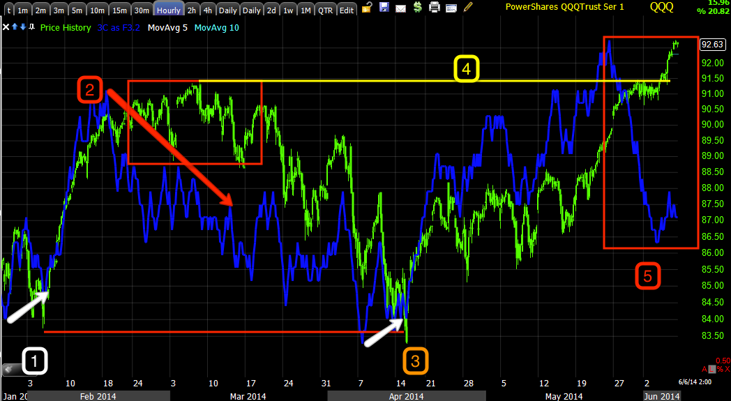
Something like this, as soon as the Q's broke below this area in March, they promptly retraced the entire Feb. rally, the IWM did the same.

One thing to look for is high closing / daily candlestick volume. We already have the change in character in price's Rate of Change, a high volume daily candle in the averages will be the big red flag I'll be looking for.


Friday, June 6, 2014

Broad Market Update

The trend most of this week were minor intraday 3C divergences (1 min), they seemed aimed at making slight corrections, however just past 1 min and underlying trade was very clear and consistent through the week. Remember that this is the area we expected around mid-May to hit BEFORE a move lower would materialize, to REALLY understand why, I'd suggest reading our two articles,
"Understanding the Head Fake Move" as this is a concept in every asset, every timeframe and it's seen at least 80% of the time, usually just before a reversal so it's worth reading or re-reading.

* Understanding the Head-Fake Move Part 1 "How Technical Analysis Went from an Asset to a Trap"

* Understanding the Head-Fake Move Part 2 "Motivation"

As for the chart examples...
 For the most part the 1 min intraday charts just made small adjustments/divergences, today was the first day of the week that a larger divergence was seen on the timeframe (negative)

However, after 1 min charts, there was a lot of underlying activity, this is a 2 min chart's trend, notice the trend as the SPX crosses above the range resistance at $1900, the trend is nearly straight down.

In addition, the price trend change shouldn't be ignored, we often see an increase in the Rate of Change just as we did yesterday, just before a new trend/stage is introduced. This is a concept that works on any asset in any timeframe, for example...
 Whether a 5-day chart or..

A 15 min chart. "Changes in character lead to changes in trends".


 Again, as for the underlying action above the multi-month range which we expected to be a head fake move weeks before it started as that's another broad concept that works in any asset and any timeframe, note the longer term chart's trend .

 This goes back to January, but I'm most interested in where the February cycle/rally started and the range forming after it and what has happened during that time.

 The longer term charts remove noise and some details, but they give you a broader perspective of the trend. I found this interesting because another money flow indicator which is not 3C, had almost the exact same signals, definitely the same trends.

I'm pretty much looking at both charts starting from the distribution around January leading the market lower in to the February lows and rally, then the indicator unable to make a new high with price and quickly falling to a new low, exactly the same as 3C above, although I have no idea how this indicator is constructed.

 The 1 min Q's also just saw minor "steering " adjustments, again that is until today which is the largest 1 min divergence of the week (negative like the SPY today).


 The longer timeframes beyond 1 min showed a negative trend and again, in this case it starts right around the time price crosses resistance from the Feb. high in the QQQ which was completely retraced in the Q's.

 Again, close to inline until price crosses in to the "Head fake zone" above resistance, the breakout level where retail will buy and offer demand institutional money can sell/short in to. 

The trend of this week (red) is notable.

 QQQ 15

 Although the Q's have their own underlying trend, it is reminiscent of the other "Smart Money Flow" indicator.
Again, distribution in to early January leading to the Feb lows and rally, distribution at the start of the Feb rally top and a new leading negative low. The signals aren't exactly the same, but it's also the Q's rather than the SPX  and of course different indicators, but showing the same broad trends.

Compare...


Note there's no distribution here in the IWM (yellow) as there's no higher prices, as soon as there are higher prices to sell in to/demand, note the change in 3C.

I had been saying I expected the IWM to outperform as it had underperformed and was slipping, it had its best week of 2014.

 There were several reasons I expected the IWM to show better relative performance vs the other averages, here's one, however the positive divegrence sending it higher has turned negative quickly today.

And the broad trend , Jan distribution, February distribution, new leading negative lows in which the IWM followed.

As for leading indicators...
 This is the trend in High Yield Credit, Institutional money's "Risk on" asset, they aren't quite so excited as the SPX.

This is HY credit today specifically.

Again, the trend among smart money (our smart money sentiment indicators) shows they aren't buying either.

This is the second sentiment indicator we use for confirmation. Ever since the cross above the range, pros have not been keen to follow.

 This is 20+ year treasuries today, I'm still not sure I understand the dynamic or new dynamic in Treasuries, but, this is not suppose to happen...

 TLT vs SPX, this is a risk on trade and a flight to safety trade at the same time, for months the argument is one has to be wrong, I'm not sure as Treasury sentiment has changed massively as the F_E_D backs out of purchases with no other major buyer left. Or it could be distribution in one frees up funds to buy the other, it's one of the puzzles I'm interested in solving quickly.


VIX was pounded today, in fact to Feb. 2007 lows, and anyone wonders why the F_E_D is worried about complacency in the market?
 However as VIX hit its new low, the market gained nothing from it today.

And talk about  strange...
Look at the After Hours volume spikes in VXX, the first one sent price a bit higher on the hit. What is going on here? I suspect we'll find out over the next few days as VIX futures (not spot) were showing strength today as seen in today's futures update.

As for breadth...
 The NASDAQ Composite (all NASDAQ stocks) is seeing strong deterioration in its advance/decline line (A/D in green, COMPQX in red).

 The Absolute Breadth Index is also falling off to one of the worst historical readings on record. 

High levels are associated with bottoms as you see in 2009, low levels are associated with tops as you see an extreme divergence through 2014.

Looking at a longer view...
 The 200 top can clearly be seen as ABI falls off, the 2002/2003 bottom can be seen as it rises, the 2007 top is seen as well as the 2009 bottom, compare price vs the fall-off in 2014, that's extreme.

 Here's the same chart as above so you can see it with no notations..

And finally, NYSE new highs, again not a picture of health, especially given the recent short squeezes.

I'll be looking through my 300 stock watchlists and looking for trends as I did last Friday and had decided to wait on any new entries, the trend of several hundred stocks often becomes clear and gives you a different or unique perspective.

Have a great weekend!

EOD Update Coming....

The Week Ahead

Looking at the 3C charts in to the close in both the averages and futures, my feeling is the head fake move above $1900 which was resistance of the 3 month range and the area we expected a head fake move which in my opinion is more than large enough to do what they are intended to do, will start being resolved to the downside next week, it looks from the 3C charts going in to the close that this will likely start early next week. I'm not sold on one lump sum move, but rather more of something like a stair step, when $1900 is broken on the downside, I think that's where we get a lump sum move.

The move above has been very hollow, mostly short squeeze, large institutional selling, large retail buying, this is called "Leaving retail holding the bag".

As my earlier post, F_E_D Correlation, indicated, I think the excess 25-30 point SPX disconnect with the F_E_D balance sheet and/od CONTEXT is reflective of the head fake move. I do think that the market will front run the F_E_D and as I indicated in mid-May, I believed we needed a failed move above SPX $1900 (head fake) before that process could start.

There are numerous assets I'm interested in, I'll see what the watchlist (as I have 300 stocks on there now) looks like over the weekend.

More to come

Futures Update

The divergence on the 1 min Es chart that I posted earlier is quite a bit worse right now. As mentioned earlier I received several sentiment updates from members yesterday who monitor the Twitter stream and the prevailing sentiment seems to have been to fade the short squeeze yesterday, I would imagine they'd go for the cheapest rout with the most bang for the buck, weekly puts, likely expiring today (I made a fat finger trade and the first set of IWM puts opened with today's expiration when I meant to open for next Friday's, the second set are for next Friday. If I open a 3rd set, they will be at least a month out). This may be why we are seeing so little movement after 2 p.m., however if they (those who control the pin) wanted to, they could take the market higher and achieve the same effect.

Here are the charts...
 The intraday ES chart has deteriorated even more, this won't hold up over the weekend like a chart of the averages, not 1 min. futures divergences, but at 5 mins they will and that has often been a timeframe where I'll look at trades.

In any case, I didn't need to draw on the chart, the divergence leading negative is VERY clear.

This is what is important , the migration of the divergence to longer timeframes like this 5 min NQ chart, these will hold up over a weekend.

And the move out to 15 min like this TF, that's migration or the divergence getting stronger.

 VIX Futures are interesting, not only the ROC in price from down to sideways to now a slight "U" shape, but the continuing leading positive divergence that is also migrating .

 Here it is on a 5 min chart, mostly today only and ...

A sharp leading positive on a 15 min chart.


2 p.m. Op-Ex Pin Removal

Friday's are some of my least favorite days since weekly options, we use to have to deal with the Max pain options expiration pin once a month (monthly/standards). Many people calculate max pain which is the price level where the greatest number of options (both puts and calls) will expire worthless since it tends to be smart money who writes option contracts and retail that buys them (again, calls or puts).

Based on a 3 year study of information gathered from the CME analyzing 5 options markets, the S&P 500, eurodollars, Japanese yen, live cattle and Nasdaq 100, three out of four options expire worthless. Looking at put options alone, 82.6% expired worthless for these five markets *this is subject to the trend of the underlying asset. a 3-year CME study (1997-1999) found the same, of options held to expiration , between 75.8 and 77.5 expired worthless.

In any case, the actual open interest use to be used to try to calculate where max pain would be, now there are plenty of online calculators that use the dollar amount rather than the open interest, but very few are real time and only updated at the close which makes it difficult.

Note today we've stayed pretty much in a tight range...
SPY, yesterday's short squeeze just after the Draghi disappointment and market decline setting in and just after the Appaloosa call in to CNBC around 11 a.m. (covered in last night's post). Note the range today. Yesterday numerous members who track the trends of retail traders via StockTwits were emailing me that the overwhelming sentiment was to fade the short squeeze, if that was done with put options expiring today (as this is a weekly expiration), then the pin level today would make sense as those contracts would expire worthless.

In any case, I don't know if your broker bothers me as much as mine does, but come Friday I have emails and numerous phone calls asking what I intend to do with option positions that still may be open. I've noticed by about 2 p.m., most contracts seem to be closed and the market starts to move away from the op-ex pin.

However, more importantly the last 2 hours of Friday tend to give me some of the best 3C information for the following week, this has included the February rally that we were able to predict as early as Jan 28th, especially the head fake move on Monday February 3rd and all of this at least 7-days before the actual move started which was described as going to be "Very scary". We've been able to forecast ranges , even head fake moves of major consequence all from the last 2 hours of 3C data which may be very different than price data as 3C tends to pick up right where it left off on the next trading day, even over a weekend , even over a holiday weekend.

I'll be looking for those underlying trends for next week and may open some positions. Looking at QQQ, PSQ, QID, QLD, TQQQ and SQQQ, they all are EXACTLY the same with the worst leading negative divegrence since at least early February. *I'm holding SQQQ long and will continue to do so.

Here are the charts of the 6 different leveraged versions of QQQ long/short, although they move almost exactly the same in terms of their leverage vs underlying asset movement, 3C is largely based on volume, the volume between the 6 different assets is totally different, therefore any divergences that match up, are because there's something going on there, not because of the correlation between the assets.

 60 min QQQ ... #1 the start/accumulation of the February cycle we had been looking for since the first hints popped up Jan. 28th, the move up started Feb. 6th. At #2 QQQ went negative in a range and then retraced the entire February rally at #3 which had a small positive divegrence . The head fake move we were looking for would be above resistance at #4 and the leading negative divegrence at #5 is the largest and strongest divergence on the chart by far. So far EVERY divergence on this chart has forecasted a move.

PSQ is the inverse of QQQ (no leverage), to confirm it should give roughly the opposite signals, there aren't too many out this far at 60 mins as they have to be very strong to reach this timeframe, however there is a leading positive right now that confirms the QQQ's leading negative and it is under support, which would be the inverse head fake move that the Q's saw.


QLD is the 2x leveraged long QQQ ETF, again at #1 the accumulation of the Feb. cycle, at 2 distribution which is leading negative, but looks more like a relative divegrence (weaker form) compared to the current leading negative and the smaller divergence at #2 retraced the entire February rally at #3. Resistance or where a head fake move would be anticipated is above #4's trendline and as that happens, the 60 min chart is leading negative confirming the above charts with another very strong divergence over a relatively short period compared to the divergence at #2.

 QID is the 2x leveraged bear ETF of the QQQ, it sees distribution at early February where the Feb cycle starts as it should, a positive divegrence at #2 that matched the QQQ and QLD's negative divergence at the same area, support at #4 and a huge leading positive divegrence as price drops below support which is how we confirm a head fake move from a real move as a real move would see 3C move with price as you see it do at so many other areas on the chart.


TQQQ is the 3x leveraged long QQQ ETF, it too is in a massive leading negative divegrence as soon as resistance is crossed, a breakout.

Finally...

SQQQ, the 3x leveraged inverse or bear QQQ ETF which is the position I hold long. There's distribution as there should be early Feb., a positive divegrence at #2 and at the break under support (head fake move we were expecting around mid-May) has a huge leading positive divegrence, larger than anything on the chart.

All 6 charts have nearly perfect confirmation and very strong divergences.