I don't really have time to go over each of the charts because of the F_O_M_C and looking for clues, but this should give you some idea based on our concepts, based on the charts as to why I like Financials short, despite the talking heads that believe financials will benefit from rising rates.
The 4-day chart (I usually use 5-day, but this was just a better fit for the zoom presets) . At "A" we have two failures to meet the upper trend channel resistance trend line, at "B" the sharp October sell-off, which as you'll see acted like a Channel buster for price just after which is a concept everyone should be familiar with, if you need information on the concept let me know and I'll get it to you. At "D" we have the triangles in the major averages and industry groups through most of 2015. Unlike the bullish looking SPX's ascending triangle, the Financials had a symmetrical triangle like AAPL which has no bias other than the preceding uptrend so it would be taken as a bullish triangle as well by Technical traders even though these are way too large to be consolidation/continuation triangles.
At 'e' we have the break above the triangles expected, the SPX ended with a head fake move in May on the breakout, failed and headed lower , below the triangle's apex. Financials are still in the area and I still consider it a head fake move, thus a decent area for entries which is why we added Financials short recently.
Here's the October low which is a channel buster here and produces the normal channel buster, high momentum reversal bringing XLF back from below the channel to the upper trendily which it had missed twice previously before the October sell-off. This led to the Sym. triangle and the same breakout above we forecasted for the broad market as well as forecasting it would be a head fake/false breakout.
Here's the SPX in white compared to XLF in green on a daily chart in the area of the triangle and head fake in the SPX. As I have said numerous times, most industry groups and stocks will follow the market directionally, at least 2/3rds so knowing what to expect from the broad market gives you a good idea of what to expect from any individual asset which is why even intraday Market Updates can be helpful for individual or specific stock positions.
The 22-day moving average that we use in our X-Over screen has been holding well for XLF, which means the X-OVer screen is probably a good tool for XLF analysis.
You can see the last 2 candlestick reversal signals to the downside as well as support on increasing volume at the white arrows, remember it just has to be increasing over the previous day, which makes these reversal candles 3-4 times more effective than without the volume as we see to the far right at the yellow arrow,
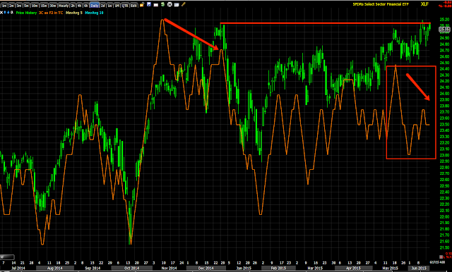
The daily XLF 3C chart (negative).
Interestingly XLF's leading negative on a 60 min chart confirmed by...
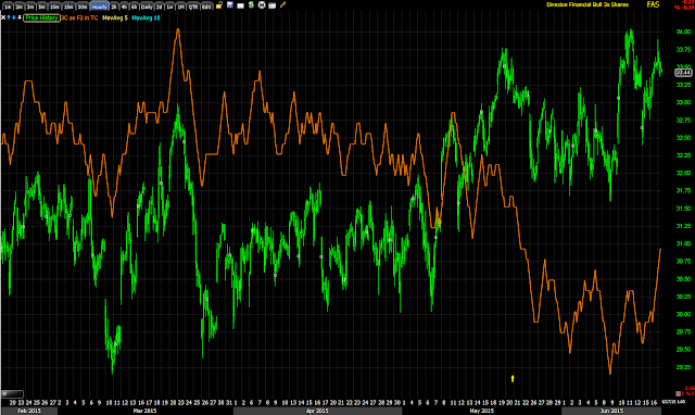
FAS, 3x long Financials leading negative on a 60 min chart.
FAZ 3x short financials leading positive divergence on a 60 min chart.
UYG 2x long Financials leading negative on a 60 min chart and...
SKF 2x short Financials leading positive on a 60 min chart. That's a lot of good confirmation in multiple assets.
Starting from the shortest timeframes in XLF, the 1 min'
3 min
5 min
10 min
15 min
And 30 min.
The 60 min is above. We also have good multiple timeframe confirmation as well.
I like Financials in the area short as its an excellent entry and much lower risk than say something like an entry in transports right now.
Is interest rates about to start going up?
-
Yes, I know - it does not make any sense - FED is about to cut
rates...but....real world interest rates are not always what FED wants it
to be.
6 years ago


No comments:
Post a Comment