First Risk Asset charts...
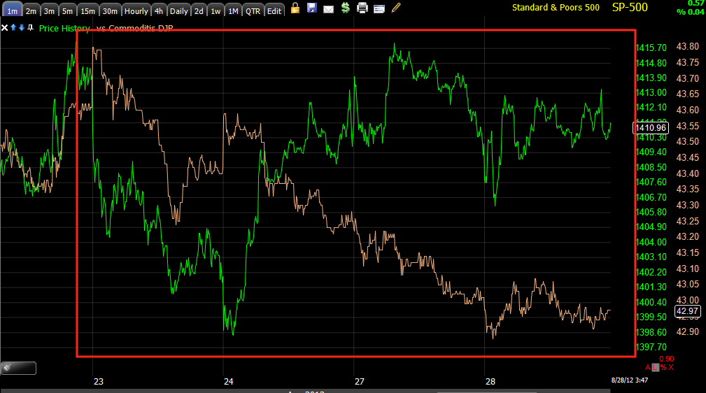
Commodities are a risk asset, they should move with the SPX, at least generally, the dislocation here is one of the many signs that probabilities (which is all we base opinions on-lacking the crystal ball and all) are skewed toward this being a double top and not a breakout move.
The last decent move down we had was where we established the core short positions, even with a move up in the market, most of these are still at a profit, PCLN for example at +22%, CAT @+ 20%, BEAV @ +13% and these were at even bigger gains at the June 4th low, it would seem that money was lost by not closing the shorts then, but I decided to hedge them instead with an equal amount of Ultra or 3x long ETFs, those all made money on the move up making up for any draw down in the short positions and then some, while still maintaining a short presence in case we had a Black Swan moment.
The point here being this was one of the indications back in March and April that told us we should be selling the market short while most traders only saw a higher high in the market at March. If you look back at that time in the archives, we entered almost every one of those shorts on the choppy moves to the highs in the market (ie. in the first red box there were 3 new highs), so we in fact not only shorted at the top at what most technical traders thought was a new high, but specifically we shorted in to the strongest moments of that top.
That dislocation between commodities and the SPX is the same concept as the dislocation between the two now seen above at the first chart.
Yields I explain as being, "Like a magnet for stock prices", so when these go negative vs the SPX, that's another signal something isn't right in the market.
Here's a larger view of the dislocation now, it keeps adding lower lows in a sharp way. I won't get too far in to it, but the sharpness of the dislocation is similar to the theme of hedge funds and others needing to close positions/short positions while their window of opportunity is still open, it's more of a desperate situation now then at March/April when the rally was running out of steam as the macro-economic data moved out of the seasonal adjustment period to disappoint.

Still, look at the size of the dislocation now vs the March/April timeframe. Again, I won't get too far in to it, but I have mentioned there are many indications that make this rally from the June 4th lows look a lot more like a bear market counter trend rally that what price actually shows to be the trend.
The carry trade currency and China/Japan barometer currency, the $AUD has also dislocated as it did in March/April as well, today's action in the $AUD was sharply negative.
As mentioned this morning and one of the reasons I thought we'd actually get the short term price strength this morning is due to the EUR/USD, the Euro here in orange vs the SPX is supportive of short term risk, the market formed a triangle which is similar to a Bollinger Band Squeeze, a highly directional move will come out of this pattern, RIGHT NOW the Euro is supportive of higher prices in the market, but taking a closer look at the Euro itself as well as the dollar (which is down today which is also supportive of higher prices in risk assets from stocks to oil to gold), it also appears to be fairly clear that the window for short term price movement is closing.
The following charts are clear migration of a negative divergence in the Euro and a positive in the $USD, this is not a good sign for the market, when these reverse the window closes.
Euro 1 min deteriorating all day as the Euro remains locked in a range, unable to add to its gains.
The migration of that divergence to the next longest timeframe (remember a late day short term positive divergence was building late yesterday in the Euro, now the opposite is happening.)
Euro 3 min chart very sharp negative leading divergence.
Euro 5 min leading negative divergence.
In watching many of these divergences in FX ETFs, they almost always will wait for the next day rather than play out overnight. So it is conceivable that early strength is present in the market on the open as this window continues to shut.
This is UUP/$USD's price, not 3C, the softness in the $USD today is positive for the market, the market didn't capitalize off that today, but the market wasn't asleep at the wheel either, it was forming the most recognizable price pattern in Technical Analysis, a symmetrical triangle. I don't quite understand how that fits in to the end game, but I think by the time this is all over, it will be clear that today wasn't the wasted day that the percentage change would imply.
$USD/UUP 2 min positive, not only confirming the above UUP/$USD chart, but as the other ha;f of the EUR/USD pair, also confirming the Euro charts above.
5 min chart already in a large positive divergence which was added to today
It's probably not coincidental that the $USD formed a bear flag with a bearish descending triangle right below major support, traders will interpret this as... Bearish, but there's more to price than just price patterns, that's what allows Wall Street to use technical analysis against technical traders so often.
Because of the spotty/gappy nature of UUP, it's easier to see with a line chart, note the descending triangle and below major support while a positive divergence builds in UUP, also recall that late yesterday there was a small negative divergence in UUP/$USD and here it is down today. The positive already in place is much larger than yesterday's negative and at a key area with a key price formation.
UUP/USD 30 min positive in leading position t the bearish price formation, the leading positive divergence was added to today which is always an accomplishment on such a long timeframe in a single day.
The $AUD chart intraday today led aggressively lower.
It also looks like credit was making a move out of sync with the market, this is pretty late in the day to draw conclusions from, but at least it wasn't leading price.
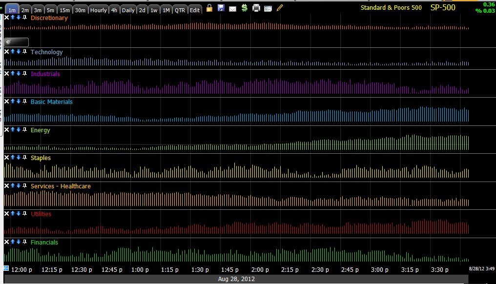
For whatever it is worth, and I'll look closer at the industry groups, late day rotation was out of Financials, out of Industrials, out of Tech and Discretionary, Energy saw flows in as did basic materials, and the defensive Utilities.
More as I uncover it.


No comments:
Post a Comment