As was posted last night, when you cut through the "unemployment" front, look at the dichotomies between easing policy actions and manufacturing and how that interlinks with unemployment, it seems very much like QE3, which Warsh said looked like, "Panic", probably has more to do with financials than anything, however that's not going to be a popular basis politically when the F_E_D is already under a lot of heat for launching QE3 just before an election, to come out and say, "We're trying to help the banks" or even worse, "We are really worried about the banking system", it just doesn't fly for the F_E_D, unemployment though will get them through the policy with the least political damage, but it all points back to something going on with Financials.
Bernie may be one of the most powerful people in the world, but he's still a person and the Bear/Lehman era is sure to have left some long lasting scars, that was without a doubt, the most difficult period of his tenure so if policy now looks "Panicked" according to ex- F_E_D governors (with the caveat, "Unless he knows something we don't"), there's likely a reason and I think it falls right in the financial sector.
Looking at Financials and some leveraged Financials, there's a bit of confirmation vs the market, that's to say there's the same choppy, non-trending signals in the same timeframes as the market averages, but when you clear away the details or day to day noise, the trends are much clearer, just as with the market.
I still think the probabilities are highest for a bounce, but that may not be enough to get the market out of the woods.
Short term charts are messy, choppy and erratic; I do believe that has a lot to do with a holding pattern in front of the ECB tomorrow. I doubt the ECB is going to do much that will kill the market, the French and Spanish auctions may not help, but they're a sideshow to the ECB's policy.
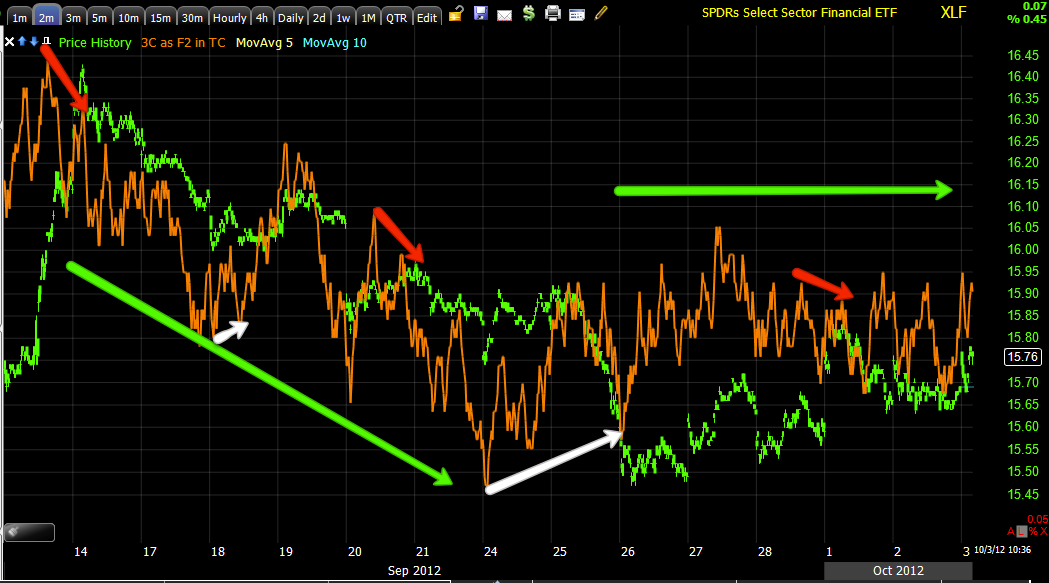
The Financial Charts...
This is the 1 min Financial chart, typically we have a trend that's obvious on a long history 1 min chart, here we have a couple of divergences that can be pointed out, but the closest thing to a trend is the green "in line" or price/3C trend confirmation; which means there hasn't been any strong underlying action either way which is also similar to most of the market averages.
Double checking with the 2 min chart, again, I can point out and find some divergences at reversal areas short term, but again the main trend is that of confirmation (green arrows), which is something we have not seen a lot of until QE3 was announced, again I think it's the split market or bifurcation as the market seems to have lost that risk on/risk off market correlation.
The 15 min Financial chart also has some divergences, but the main trend here again is still in line. I don't recall the last time we saw something like this in which underlying action was either that weak or that split as I pointed out in the AAPL/RIMM comparison yesterday.
When we get clear of the noise in the 60 min timeframe, a trend becomes more visible in 3C, confirmation up until the QE3 highs at which point there were several large negative divergences, we've seen what has happened to price since, there does "appear" to be a more recent "somewhat" positive divergence at the white arrow, it is however within the context of a leading negative position in 3C. I'll also point out the pure price trend going from down to losing momentum and drifting laterally/up, I've been saying that the market is overdue for an upside correction.
If we zoom that same chart in so it follows price action, you can see it is more in line than positive, so my interpretation would be we have a weak positive in Financials, probably along the lines of the upside correction I've been saying we are overdue for.
Go out even further to the 4 hour chart which is the most important of the intraday timeframes and we are negative at the March/April highs, positive at the June lows and see a large negative divergence not only on the rally off the June lows, but leading negative AFTER QE3 was announced.
I'd say Financials and the market will see an upside correction, I think the damage on the 4 hour chart though will be difficult to overcome; it's not just in Financials as you know.
Many times the derivative ETFs can confirm for us so I looked at FAS/FAZ (3x long/3x short financials). On the short intraday timeframes they confirm XLF and market average and lack a trend so I moved to the timeframes that do show a trend (so there is confirmation of the shorter timeframe, it just lacks a trend like the shorter XLF timeframes), the 30 min FAS (long financials 3x) chart which went negative at the QE pop/top and actually leading negative. There's a positive within that leading negative position like the XLF 60 min chart.
FAS 4 hour, lik XLF went negative at March/April 2012, positive at the June bottom and negative again at QE3 pop/top and leading negative since-the same signal as XLF.

The 30 min FAZ (short Financials 3x) should look the exact opposite if it is to confirm, it goes positive in to the QE3 announcement (white) and since has been in a leading positive position, but recently in a negative divergence, this is almost the exact opposite of the XLF/FAS charts in this timeframe.
At 4 hours, FAZ is again positive at the QE3 lows and leading positive since, XLF and FAS which are the long version are exactly the opposite in being leading negative.
Bottom line, it appears that there will be a move up in Financials, the timing hasn't developed on short term charts and I think that is ECB related (tomorrow), but the longer, more important charts have deteriorated on the Financials.
If you recall yesterday, we saw almost the exact same thing in Energy.


No comments:
Post a Comment