As I said I'd bring them to you as I dug them up, on the Risk Layout chart there were some interesting indications, still along the same lines of local support (which doesn't mean bullish, it often is just shakeout volatility, but we aren't making a final determination on that, we are letting the market tell us and looking at longs and shorts that seem to make sense) and longer term deterioration.
Here's what I mean (and just putting it out there... a crack below the area of support I showed you in the last post for the QQQ and just about every other average, would be a very dramatic event).
This is High Yield Corporate Credit (very liquid) vs the SPX in blue on a 1 min chart, as for an intraday signal, this isn't screaming, but it is worth noting, Credit dipped below its close yesterday and moved back above it while the SPX (green) is still below its close yesterday, credit generally leads even though this is a very minor signal.
Longer term, before QE3was announced HY Corp Credit had been doing well, after the announcement it started underperforming and broke below the announcement date of the 13th (red trend line) long before the SPX did (orange). In addition, Credit is much more negative than equities and in almost every circumstance credit leads equities. So that's a longer term view which is similar to the longer term 3C charts of the last post, but short term Credit also failed to make a lower low here, so that is another sign that a bounce from this support area is likely.
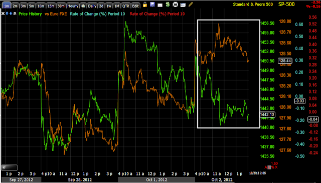
The Euro intraday is performing better than the SPX, I would expect this to be a leading signal intraday for the SPX to move toward the Euro.
Longer term they have been pretty much in lock step, however we've had more than 2 weeks of trending down without any significant correction and both have a support area below them.
Remember in my Energy 3x long, I'm looking for some upside to dump that position.
Yields also lead the market, they are leading the SPX lower, but short term also have a support level here.
Longer term, this is probably the biggest negative divergence in yields vs the SPX I have seen since we started using them, again, much like the long term 3C charts.
Is interest rates about to start going up?
-
Yes, I know - it does not make any sense - FED is about to cut
rates...but....real world interest rates are not always what FED wants it
to be.
6 years ago


No comments:
Post a Comment