In the very near term GOOG isn't too dissimilar from AAPL or AMZN, at least in the approach and concept, "Let the trade come to you", which is mostly for those who want to add or start a new position.
Here's what GOOG looks like from top to bottom. I must warn you, some of the longer term charts are graphic and not meant for GOOG long's eyes. In fact some of the longer term charts are so disconnected from the trend that you might doubt them, understand this though, I have applied 3C to just about every bull and bear market of the last century and 1929 wasn't the surprise that most think it was, the charts were really ugly before the Black day hit. I have seen what the homebuilders looked like in 2000 while the Tech bubble was blowing up and spurting semiconductors all over the place, there was a staggering amount of accumulation and back then when Juniper or Cienna was all anyone would talk about, a rally in the home-builders and housing prices leading the next bull market seemed about as far from reality as you could possibly get, but smart money knew several years in advance and made well over 2500% so as unbelievable as some of these GOOG charts may look, I'll just remind you that people were dismissive of the negative AAPL charts as it hit $700 and the overall market when it had a larger negative divergence as QE3 was announced (we got 1.5 days of rally and then dropped from Sept. 14th to November 16th-no one wanted to believe that either, 'Don't fight the F_E_D". I'm just saying, I've seen these extremes and they don't look reasonable or even possible and it turns out, most of the time, they are!

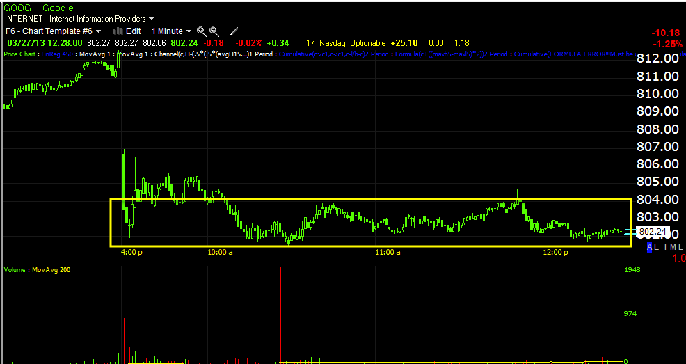
Today's trade has thus far held up above support at $801.47, but only by $.03 cents as the low has been a very round $801.50, I believe the $801.47 support area will likely be broken before GOOG even considers a run higher, it should also bring some decent volume in, if it does, then you know the shake out of the stops worked and shares would likely be accumulated (we'd have to wait for the event and check the charts) as there would be lots of supply at relatively cheap levels considering the locality.
This is the basic fuel that jump starts a move to the upside, the short covering is like the second stage booster rocket, Wall Street has to do very little at that point as "Escape velocity is reached, they can sit back and spoon out short term accumulated shares in to higher prices and demand until they are out and the rocket falls back to earth. We want to add or initiate just as the rocket loses upside momentum and just before it turns nose down.

Note volume today as morning lows were broken.


This is a bad leading negative divergence, but I've seen worse completed with price moving as suggested.


No comments:
Post a Comment