I haven't seen all the particulars, but it seems ORCL's earnings were a disaster, missing on multiple business levels that they had just guided on recently.
In any case, I have some charts, it's definitely a "Put it on the radar" asset because we don't want to chase something like this.
We actually traded ORCL around March of last year short and appear to have had several members do very well with different trades.
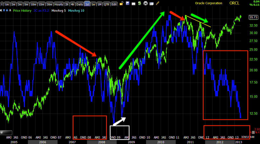
I first suspected this was one of our trades when I saw the triangle trendlines drew in as I pulled up the chart as well as a channel that is harder to see within the triangle. It looks like 2007 was going to be a top of some form until QE1 rescued the entire market early 2009, but looking at the trend since 2002 or even further back, this triangle is significant. Tops often share some relation in size vs how long the trend existed.
Volume is horrible from 2012 forward.
I'm using a longer term 2 day 3C chart here which shows some distribution far left around 1990 and ORCL lost ground, then had a confirmed trend up for 7 or 8 years before red flags started showing up at the 2000 Tech Bubble top, where it once again saw distribution (also leading). One of the most obvious red flags was the upside change in volatility/trend, although it feels great when you are long, it also makes a lot of people fall in love with the stock and when it starts to fall they hold because they made so much money in ORCL in the past, they just know it's coming back.
ORCL lost somewhere around 85% in the tech crash. "
Changes in character lead to changes in trends" and the parabolic move up shows exactly why I don't trust them because they tend to end just as extreme and bad as they went up.
At 2002 ORCL bottomed which was the start of the new bull market that gained momentum in 2003, there's accumulation there, although it doesn't look large, it's 5 intense months and shows signs over the next two years into 2004. Obviously the 2007 distribution / top is clear as is the 2009 bottom
Green arrows are trend confirmation, ORCL had a lot of that in the 1990's. The current negative divergence is leading negative and by far the worst.
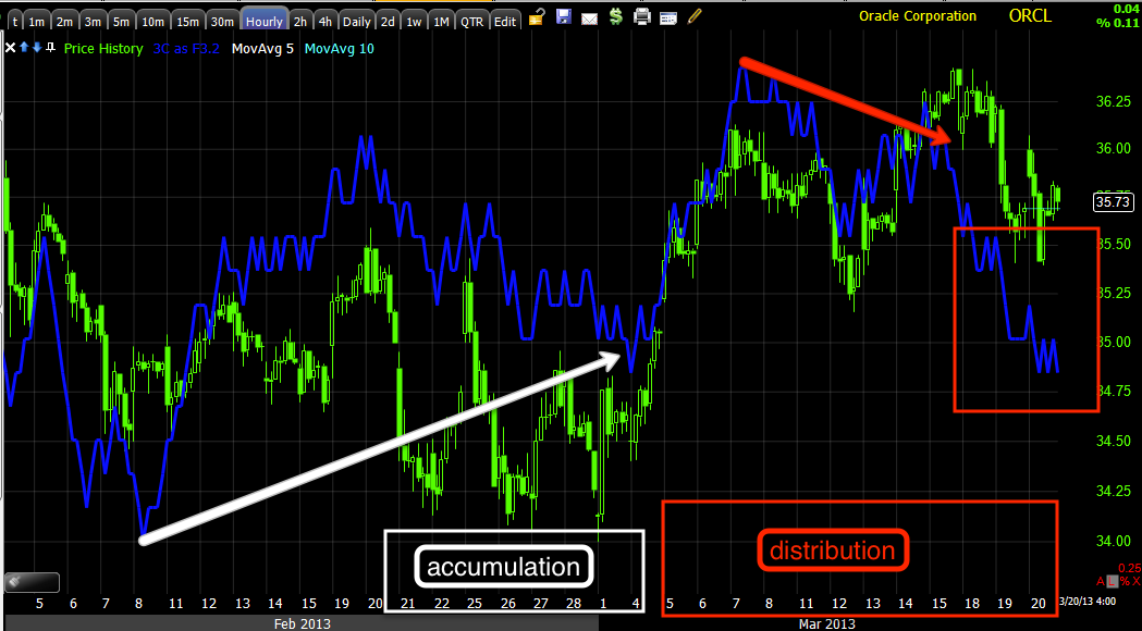
Here's a closer look from the 2007 top to present.
MoneyStream is a totally different form of money flow indicator, but a good one and it confirms the same as 3C on a 2-day chart, 2007 top, 2009 bottom, leading negative distribution now.
Here's an hourly chart showing what we often see before a stock breaks hard, accumulation that serves to lift the stock and then distribution in to higher prices and demand.
When I was capturing the charts I wasn't sure if we traded this one, I looked and we did.
There are numerous posts on it, but march 20th of 2012 there was a post showing what we were looking for to happen,
"
if they run a shakeout and this is just experience and gut, I have no evidence, then near the Trend Channel stop out (on a closing basis), there is a very juicy looking level of resistance, a break through that (at the yellow trendline) would almost certainly shakeout shorts. This is why I prefer wide stops on initial positions, it would be a shame to get booted from a good short on a shakeout move. Just be aware of the area and remember psychology, the market is about fear and greed, the more powerful a shakeout or head fake move, the more it moves emotions which for too many traders dictate decisions."
The chart and juicy shakeout level?
This was the area we were watching for a set up...
This is the juicy level and entry on a head fake move that completed that same day, beautiful entry. The trade lasted until May.
ORCL has much bigger problems that I think most understand with that level of distribution, it's the worst divergence in multiple decades.


No comments:
Post a Comment