Wednesday, November 6, 2013

GLD and GDX Follow up

Tuesday I started new, short duration, leveraged (call option) positions in GLD and GDX (gold miners). For risk management purposes, I split the risk for both positions as if they were one single position just to have a little diversification in case GLD acts more like a "Taper-Off" trade as per my earlier analysis.

I warned last week that I expected a pullback in Gold/GLD/GDX/NUGT , but...

"Not too much has changed in the assessment for both, but there is a decent chance for some misleading activity and a decent chance for some trades if you are pretty aggressive."

We have seen a pullback in all of these assets as you can see below in gold futures ever since the F_O_M_C policy statement.

As you can see gold has pulled back since the F_O_M_C which is a "Taper-On" or "QE-Off" expression in this asset, but this pullback in gold was also something that was expected even before the F_O_M_C.

When I said there was a chance for "Misleading activity", but also a chance for some trades for more aggressive traders, it was exactly this kind of a counter trend (trend being the pullback) bounce that I suspected we'd see and that may be "misleading" if traders saw the bounce up during the pullback and automatically assumed that the gold pullback was over.

As of yesterday I did not see enough accumulation or a wide enough base to make this counter trend trade worthwhile...

"I do believe this will likely see an upside, shorter term move, I'm not very interested in trying to trade it as I believe the larger trend that should continue to unfold is the larger, most probable and safest trend."

As of today, the short term (small) base seen above in white at the far right of the gold futures chart started to look a little more worthy of a short duration, aggressive long play and that's why 
I decided to enter 1/2 GLD and 1/2 GDX.

Here are the charts including NUGT which I also thought was a possible way to play a short duration bounce in gold and gold miners; as well as DUST which is used only for trend analysis and confirmation.
15 min Gold Futures are also showing a positive divegrence like the 30 min which I think is mature enough to sustain a bounce to the upside, I decided to use the leverage of options because I believe the duration of the trade will be short, thus the use of either options or leveraged ETFs.

GLD (Gold ETF)
 The 60 min GLD chart shows a negative divergence as the most prominent divergence suggesting the primary trend for this timeframe is a pullback, this is why I expect GLD/gold to ultimately make a larger pullback even though it looks likely we will see a short duration counter trend (the trend being the pullback) bounce. 

*This is why I said we might see activity (bounce) that may be misleading suggesting the pullback is complete when I doubt very much that the pullback is complete even though I'm putting high probabilities on a short term bounce.

GDX (Gold Miners)...GDX has had a fairly tight correlation with GLD recently so it's highly probable that they move in similar fashion, although the relative performance may be different, thus my reason for splitting the position between both the metal and the miners.
 GDX 30 min chart shows the accumulation that sent GDX higher and the prominent most recent underlying trend being that of a negative divegrence or a pullback much like gold/GLD.

 The 15 min GDX chart shows the pullback signal and a recent, smaller positive divegrence that is leading positive suggesting a bounce which is exactly what I warned we might see as "Misleading" if one were to assume that the bounce were the end of the larger pullback signal, thus the bounce I expect to be shorter duration and as such it is a trade for more aggressive traders.

GDX 10 min showing a decent relative positive divergence.

The 5 min GDX chart is leading positive suggesting the bounce probability in the VERY near term is high, however I suspect the probabilities will ultimately see the bounce fail and the pullback continue in to accumulation or what I'd call a "Constructive Pullback" or a healthy pullback for the larger continued uptrend.

The 2 min chart is leading positive in a strong manner suggesting a bounce in GDX is imminent.

NUGT, (3x leveraged long gold miners or GDX)...
 The 15 min chart should look similar to GDX and similar to GLD. Here we see a positive divegrence sending NUGT higher, confirmation of the move higher until a negative divegrence sets in suggesting a pullback which has started and a leading positive divegrence very near term suggesting a bounce within the pullback trend, this is the trade I'm looking to take advantage of for now and its short duration is why I prefer to use the leverage of options, although a 3x leveraged long ETF like NUGT should work well for those who prefer an equity trade rather than an options trade.

 The 10 min NUGT chart shows the same themes so we have good confirmation between multiple timeframe analysis as well as confirmation of GDX and GLD.

 The 5 min NUGT chart shows the larger pullback negative divegrence and the near term leading positive suggesting a short duration bounce, thus I prefer leverage as I suspect this position will be short in duration and the leverage makes the position worthwhile.

The 2 min chart is good for timing, it shows the negative for the larger pullback trend and a leading positive for the bounce trend, it now has a foot-print or base of 2-days making it a more plausible bounce with higher probabilities.

DUST (3x leveraged short gold miners or GDX). This should have the opposite signal seen in GDX, NUGT and to some extent, GLD as well.
 The 30 min DUST chart shows the most recent larger trend to be an upside move, although a pullback here (bounce in GDX/NUGT) looks probable, the higher probability is for a continued move higher in DUST and a continued pullback in GDX and NUGT after a short duration bounce.

The 10 min chart shows the accumulation for the bounce (pullback in GLD/GDX/NUGT)

The 5 min chart is leading negative which is the opposite of the NUGT leading positive signal, thus DUST is confirming the GDX/NUGT signals.

The short term 2 min DUST chart also suggests the pullback (short duration) in DUST is likely imminent, thus a bounce in GDX/NUGT as expected and GLD.

The 1 min chart goes from upside confirmation, I suspect this trend will ultimately continue (pullback in GDX/NUGT and GLD), but the short term suggests a pullback in DUST confirming the NUGT/GDX and GLD short term bounce signals.

This looks good for GLD/GDX/NUGT long for a short duration, after that we can look at a DUST long and GDX/GLD short for a continued pullback until GLD/GDX/NUGT have built a larger base and can support a larger upside move.


Tuesday, November 5, 2013

Some Quick Thoughts

The SPY and DIA look more susceptible to a pullback (still within this chop range) than the Q's followed by IWM.

Some of the short term issues I'm paying attention to with regard to an upside move and preparing for the possibility has been based on the rounding (Reversal-like Process) shape of HYG/High Yield Corporate Credit which is manipulated and used to manipulate the market to the upside.

There are some 3C charts that are catching my attention in HYG. However we are also seeing VIX FUTURES see positive divergences (accumulation) and even a better looking VXX/UVXY chart which wasn't so hot intraday previously and suggests traders are once again moving toward protection from market downside.

I want to get out a post for you on leading indicators (In Fact I have already captured all of the charts from earlier today, but will likely re-capture them to reflect the close), it will cover short term (as in this chop that we have been mired in since Oct. 30th), swing or cycle (which would be indications since the lows of 10/9 were put in and the rally and roll over since then) and one or both of two longer timeframes which will either be 2013 or roughly since the Key 1-day reversal in the market from May 22nd or in some instances the entire market move since the March 2009 lows to present.

I think it's really important to see all of these timeframes as very short term indications can effect entries or exits for long term positions and portfolio management.

Again, I just want to thank all of you. I have always said and believed that I have the most amazing members, every one and even former members who stay in touch. To have this many great people defies reasonable statistics, you'd think there would be at least a small percentage of people who are difficult, but this has never been the case and this is why I TRULY love my job because I care about the people I do it for (All of you)  and I love the market.

Some of you have really gone above and beyond my wildest dreams and I don't know how to thank you enough for your thoughts, time, generosity, and caring. The market can be isolating for all of us, but I feel like a have an extended family rather than members. 

I'm on my way to talk to Anna's doctors, many of you asked for an update and thus far she seems to be doing fine. Tomorrow my mother has a pretty intense surgery on her back with stabilizing metal plates and rods so I'll be working from the hospital, the same one Anna is in.

Thank you again. I'll see you shortly with charts for some of the assets I talked about earlier as well as the daily wrap and any futures indications.

Trade Idea / New Position: MCP

We have been very patiently waiting on MCP for our chance to take out another long with the last one returning +38% and +58% using leverage of course.

As mentioned earlier, I thought MCP over and will open a partial position (long) in MCP, the risk management will leave room to add to MCP on a head fake/ Stop run move that will allow enough room in the risk management to add to MCP even if we had a stop run below the inrtraday lows of the year at $4.70.

I like MCP a lot and that's why I'm willing to enter a partial position without the head fake move in place. I intend to bring MCP up to a full size position if we get the head fake move, for now it will be half the normal full size core long position, which is about the same as a trading position.


Trade Idea/ New Positions: GLD / GDX Calls

I do see a difference between Gold and miners, although I like the GDX signal a bit better, gold is QE sensitive so anything QE related that moves gold may have a stronger pull in the yellow metal over the guys who dig it out of the ground.

For this reason I decided to split the risk and still treat this as 1 trade for risk management purposes, but it is split between December GDX $25 calls and GLD December $126 Calls.

Again, I see this as a counter trend bounce within a pullback in GLD/GDX, counter trend moves can be impressive.

I wouldn't have any problem with going with NUGT long and GLD or maybe a 2x leveraged long gold ETF, I don't know of any 3x leveraged long gold ETFs that have acceptable volume.

Charts will be coming, but the gist should be pretty clear as I have updated these so frequently.

GLD/GDX/NUGT

We have a little more of a base for GDX/NUGT and GLD as well, I tend to favor GDX although it doesn't make a lot of sense to me, the signals just look better especially in NUGT long or DUST short.

I'll probably look in to either GDX calls (Dec. 24) or a NUGT long TRADING POSITION and very short at that.

I think the potential "noise" is still high probability and all of these assets have more pullback to go, but very short term I think it is a little easier to go long NUGT or GDX calls, it's still aggressive and still very speculative, but now at a position that it is worth a shot for me as it wasn't yesterday or before.

Market Update

Everyone who knows me knows NOT to call me during market hours, however since Anna has been in the hospital, everyone I know has been calling so I'll have to put a message with an update and leave it at that (she's still waiting for a doctor to see her since she was admitted last night for those of you who have asked for an update, and she's feeling better as she's been on oxygen-thanks for the kind emails as always-you all are truly the best I could imagine).

I've been trying to get two updates out, one is Leading Indicators and it covers not just intraday, but the current cycle and then the longer term which can be from 2009 lows to this year with the key reversal day on May 22nd and show leading indicators have gone to "pot" since. I think this is important for you to see so you may weigh the larger probabilities vs the shorter term probabilities and make decisions about whether to be engaged in new trades in this area or whether to sit back and wait for it to clear up.

High Yield Corporate Credit is one however (short term), that I am watching carefully as it has a strong effect on the market, usually fairly short term, but it's been used more and more as volume and real demand/supply and Fear/Greed dynamics fade and the market becomes more about which carry trade can be activated, which arbitrage trade can be activated, etc. This is really a market in which most of the traditional market movers do NOT apply and the market movers that use to be used much more sparingly, the manipulative ones are really taking over.

So here we go....

 This is a 15 min chart of the SPY, in yellow is the "Chop", this is truly a meat grinder for a portfolio and for most trades as their greatest directional influence is the market and then their industry groups, which is why I want to cover what I call the "3 Pillars", they are the 3 industry groups that virtually need to be on board for a rally/bounce to stick.

"If" the chop zone was wider, it would be a great 3C trading zone as 3C does a fantastic job in these zones, but it's just too tight for me, too little profit potential and too much risk.

SPY
 I said it earlier this morning that the market was headed for a gap fill after gapping down about half way to the bottom of the lower end of the current "Chop" range.

Since the intraday 3C charts have gone leading negative. It's the actual price decline though that is useful in determining underlying action and what the next near term trend will likely be.

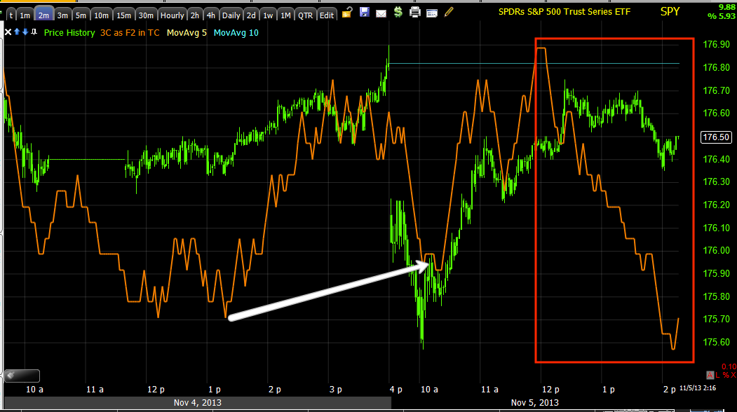
 SPY 3 min is also leading negative, this speaks to where the market is now and the underlying trend which looks like distribution on the gap fill or attempted.

The 5 min chart scaled out shows a very clear trend, but the more immediate concern is day to day as it determines our tactical entries, strategically if we zoom the chart out to the cycle's scale, there's a clear negative trend strategically.

QQQ
 Intraday the same positive off the a.m. lows and negative in to the gap fill highs of today.

 The QQQ 3 min shows the relative strength of the QQQ 3C charts I mentioned earlier as it remains in line with price.

 QQQ 5 min shows the positive divegrence and a "not so bad" negative which almost looks more like a sideways consolidation signal than a negative price decline, that's not usual for a 5 min chart, but considering the preceding positive, that's my take for the Q's.

IWM

 The trend is similar, timing different, but intraday lows from yesterday saw the intraday positiver and now a small leading negative in to today.

The 3 min is a bit more clear as to many of the recent moves being distributed.

The 5 min shows essentially the same as the 1 min, positive accumulation in to the lows yesterday or rather Friday and some negatives, but they are fairly weak.

DIA
 Same theme, intraday lows today saw accumulation for a gap fill apparently and at that gap fill 3C goes negative and leading here.

 2 min similar to some of the other distribution at highs, but this is also consistent with range bound trade, the difference is the positives aren't as consistent as the negatives and thus the downward sloping price trend.

 The 5 min DIA seems to be showing a more negative character, this may be suggesting that the chop is coming to an end, but I wouldn't make that call the same way I was willing to make the chop call, there's just not enough evidence. A move lower could still be accumulated and that's why I want to see it.

TICK
 This is the NYSE intraday TICK (number of all NYSE advancing issues per bar minus the declining issues), this is a good, quick look at market breadth intraday, it also often will call out a change in trend just before price as the TICK will lead price.

My Custom SPX/TICK Indicator (Histogram)
 This is intraday, in yellow that's where the trends up and then down get sloppy  as the previous downtrend gets noisy.

The TICK trend since the 10/9 cycle lows to present, they moved up with price early on as should be and then went negative in a pretty clear trend, that tells you about what has been going on with the actual stocks and not just the average.

I'll have more, I think this is still an environment to be careful in with short term trades, it can be useful for tactical entries/exits, but you need strong signals in the asset beyond just the current or recent chop.


Quick Intraday Update

The intraday signals for the SPY, QQQ, IWM and DIA have all seen 3C roll-over and go negative; the NYSE TICK has broken its trend as well. Intraday we should see down side.

I'm really looking closely at Credit, VIX and Treasuries.

However a pullback in the market would be very helpful for getting a better grasp on what's going on there as well as these choppy ranges are difficult on very short term analysis and it's very important for knowing when to make a move and what move to make so I'll also be hoping to get some data out of an intraday pullback in the market.

When I have the credit, VIX, Treasuries, etc ready, I'll get that out to you as well and I'll be covering PMs shortly as well as major industry groups and taking a second look at a few trades that look close.

MCP Follow Up

The last update for MCP was Friday, Nov. 1

After having had a Goldman Sachs sell rec'd and breaking below local support and seeing positive divergences on that break, it looks very much to me like GS is up to their normal game of doing the opposite of what their saying and why not, that's how they create the supply they need at favorable prices.

My feeling was that the current rounding in MCP was/is a reversal process and that it was likely about halfway through it. *Please see the last updates which are linked above and a previous update is linked within the post above.

Here's the current update and I just keep liking MCP more and more.

 You'd do well to look at a 5-day chart, but draw in this ascending triangle base-like area first on a daily chart and you really get a feel for the transition of the stages and the high likelihood of this being a strong Stage 1 base. The drop below the triangle's apex could cause you to re-draw the trendlines and you'd still have a large rectangle which is also a common base/top pattern. In fact rectangles (usually shorter term and tighter ranges) are where we most often see underlying accumulation or distribution activity, if you think about how and why a market maker or specialist would want to fill an order in such a flat range, you get a better idea of why we see them in such an environment so often.

Also note the dip below support on the GS sell signal. I believe it has been something like 7 or 8 consecutive trades that worked out by doing the opposite of what GS puts out, even to their own clients!

 Here's that break lower and when GS made their sell rec'd and the uptick in volume which is generally one of the reasons they'd do such and it's also the same reason we see head fake moves which is all MCP is really missing to make it an outstanding long and timely.

 The 60 min chart should give you a good feel for the distribution in the ascending triangle to send prices to a lower level to be accumulated which it seems they were in some size, as price went back up and out of the accumulation zone we got a big break to the downside and again this is often seen toward the end of an accumulation zone, it's like a last chance to pick up shares from weak hands on the cheap and in size which is what Wall St. firms need, size, supply.

The break has the strongest divegrence of the entire base area which only validates what we'd expect to see on such a move in a mature base.

 The 30 min chart shows the same activity, positive divergences at the lows of the range and the strongest leading positive at the break to the lowest end of the range.

 Closer to the near term, the 5 min chart shows a clear uptick in the strength of the positive divegrence AFTER GS's sell signal when prices dip and there's an uptick in volume.

I didn't even want to draw on this 2 min chart because it's so beautiful and again, right where GS first made their sell call.

The only thing missing is a 1 min chart, but I wouldn't expect to see that until/unless we had a head fake move which is seen in about 80% of all reversals, look carefully and you'll almost always see it, a false break out or failed breakout, a false breakdown or failed break down.

$4.91 or actually under $4.91 is the first area I'd expect to see such a head fake move, the second possible area is under $4.88 as that is long term support.

I don't think I'd have a problem with a phased in entry LONG in MCP as long as it is part of my risk management plan BEFORE I enter the position, that means it would need an extra wide stop to accommodate for a possible head fake where I'd make sure there's 3C confirmation of a head fake on the 1 min chart and the others, BUT SINCE THERE ARE ALREADY SO MANY POSITIVES IN PLACE, THE PROBABILITY OF A HEAD FAKE MOVE BEING CONFIRMED IS EXTREMELY HIGH. 

The best reason for confirmation at this point would be simple timing and adding the rest of the position at the most favorable price possible, while still having exposure to MCP long as that large gap down out of the triangle could very well be considered a larger head fake move.

I may enter MCP on a partial position basis, but the position I'd likely enter would be a full size core long rather than a trading position. You might feel better about phasing in with a smaller trading position. I'll set price alerts for the levels mentioned above and will be considering entering a partial position (long), IT'S THAT 2 MIN CHART'S 3C MOVES THAT ARE REALLY GRABBING MY ATTENTION AS WE HAVE BEEN WAITING ON MCP AS A NICE LONG ENTRY PATIENTLY.

Market Update

These are the averages as best as I can provide them considering a block of data os still missing from yesterday morning, but for most versions of 3C it is fine, in the very short term enough time has passed to make that data irrelevant and it's just a small glitch in the overall trend, with slightly longer timeframes, the blocks missing are fewer so again it has less effect on the overall indicator as more time passes.

There are some interesting charts in the IWM which is typically considered the average that should lead a rally, however the Russell 3000 has also taken over that role as there are more momentum stocks and stocks with high short interest that momentum players trade long looking for a short squeeze. The NASDAQ overall looks to be the strongest of the averages. So far this morning we are about half way to the lower end of the "Chop" range, even though this range is narrower than I first envisioned, I expected a more volatile range, very sloppy like a child scribbling up and down with a crayon if that mental image registers.

I'll continue to update the general market and other indications such as FX, PMs, Credit, Leading Indicators, etc. so we have our finger on the pulse to get the best idea of where and when it is most ideal to enter positions as we DO NOT want to get caught in the chop machine.

IWM
 IWM 1 min, yesterday's missing data and flat 3C are to the far left, but there's more than enough new data to consider the closing divergence reliable and it has done as it should, but remember this is an intraday 1 min chart, good for these short term moves, but not a high probability indication for much beyond intraday moves unless viewed as a longer 5000 bar trend.

The 3 min IWM shows the same negative divegrence in to the EOD ramp attempt yesterday, you may recall this is where Credit, Sentiment Indicators and Several other indications went south and would not follow the market as per last night's "Wrap" post.

 IWM 5 min with indications of a small positive for an upside bounce to the left, consistent with the size of the move and to the right a negative divegrence that is leading a little more deeply than typical at this time of day.

 I believe Thursday is when chop was hinted at and Friday the first signals came in as you see to the left and it looks like we have a negative divergence on a long enough chart (10 mins) that a move to the bottom of the range would not be surprising at all and would also be consistent with a choppy range.

The IWM 30 min and the entire cycle off the 10/9 lows, yesterday registers as "in line" rather than accumulation which is more confirmation thus far of the choppy nature being the highest probability for now.

The highest probability of this chart overall is quite clear.

QQQ
 The 3 min chart in the Q's shows the positive starting Friday and leading positive currently, even though there's a weaker relative negative divergence (red). This is part of the evidence suggesting the Q's are the strongest of the averages right now, but this also is a 3 min chart, stronger than 1 min intraday, but not a long duration chart.

The 5 min so far has stayed positive, this may be too early to measure, but it does again hint at the Q's  better relative strength.

 QQQ 30 min longer term cycle trend is clear.

SPY
 5 min positive Friday, going in to a negative late yesterday, but still not a horrible short term signal, those are on the longer term charts.

A 10 min chart showing the divergences that have thus far created this choppy lateral environment.

 TICK from yesterday was quite mellow, about +600 to -250, more positive, but pretty close to neutral, today's open shows a -1300 reading, that has improved as the morning has gone on, but one of the stronger TICK registers of the last 2 days.

And my custom TICK/SPY indicator showing TICK clearly down this morning, but looking like a gap fill attempt was likely.