Another important point that the market seems to have latched on to was realized during the post f-o-m-c press conference with what may be one of the difficulties of QE3 for the market, here's the post from that day, "What Bernie Said That the Market Didn't Like"
My job isn't to be a perma-bull or bear or even to try to sell you on my opinions, my job is to look where few others look and try to find evidence few others see, then look at the evidence and come up with probabilities and game plans. We have a lot of forward looking tools that have given us a head's up on asset direction even when the asset itself seemed to say otherwise. In watching the market every moment it is open for years now, you also come to understand some behaviors that are not found in the trading and Technical Analysis textbooks, things change and sometimes quickly.
On September 13th 45 minutes after QE3 was announced I said, "Conventionally my first instinct is to cut short exposure, but I think I'm going to wait just a bit and see how things shape up"
And...
"Right now the IWM, QQQ, and SPY/DIA to a lesser degree are showing negative divergences that I believe will bring them down as sure as the AAPL positive 5 min sent it up.
There's probably an argument that can be made to short some of these here as they can easily be covered on any move higher with pretty minimal risk, while you may not get the chance to short them at these levels. I'm fairly content with what is already positioned.
There are some other markets too that I have pointed out, but the main point is I'm not making any drastic changes on a 4 hour move, which is almost always a knee jerk reaction and against the bulk of the evidence without decent evidence to support that change."
Where the divergences of the 13th correct? Could you have made money doing the unthinkable?

The answer was yes.
As for this week, the minutes I think were the biggest development and I broke them down last night in this post so I won't cover them again.
The reaction to the Non-Farm Payrolls seemed out of place, I think it's either the minutes effect I described last night or the number simply wasn't believable in front of an election. Goldman points out:
" ...the official US unemployment rate fell 0.3 points to 7.8% as the survey of households uncovered more than 800,000 new jobs in September, 187,000 of which were due to gains in government employment. While last month’s job gains in the payroll survey were much more moderate (114,000), they accompanied increases in the workweek and came atop significant revisions in government employment."
Goldman did a good job of explaining why the unemployment rate dropped 0.3% below consensus in that the government found nearly 8x more new jobs than the month before, but refrained from asking if that data is believable.
What is believable and maybe because it's not in the headline NFP and most people don't even know about it, the "U6" unemployment rate remained unchanged at 14.7%. "U6" is considered the broadest measure of employment because it not only counts unemployed, but those who may want a job, but haven't looked in the last 4 weeks which is easy considering many people are unemployed well over 99 weeks. So this rate is nearly double the headline U3 rate, but true or not, there's nothing we can do about that except try to see what market sentiment is.
As for Sector performance since QE3's knee jerk reaction to the upside, it certainly is curious:
Healthcare +3.5%, Staples +1.5%, Utilities Unchanged, Financials & Tech -2.5%, and Energy -4.8%...
For all of you who are familiar with the Risk Asset Layout, you'll know that the top 3 performing sectors, Healthcare, Staples and Utilities are also the flight to safety sectors. The 3 most important risk on sectors, (so important I call them the "3 Pillars") Financials, Technology and Energy are the worst performers.
I want to show you the Risk Asset Charts and some other leading indicators that we have used to call both tops and bottoms, there's no bias, just the charts.
Since I brought up FCT today as a leading indicator that we have used before, but not that often, I'll start with that.
*Risk asset indicators are compared to the SPX which is always green unless otherwise noted*


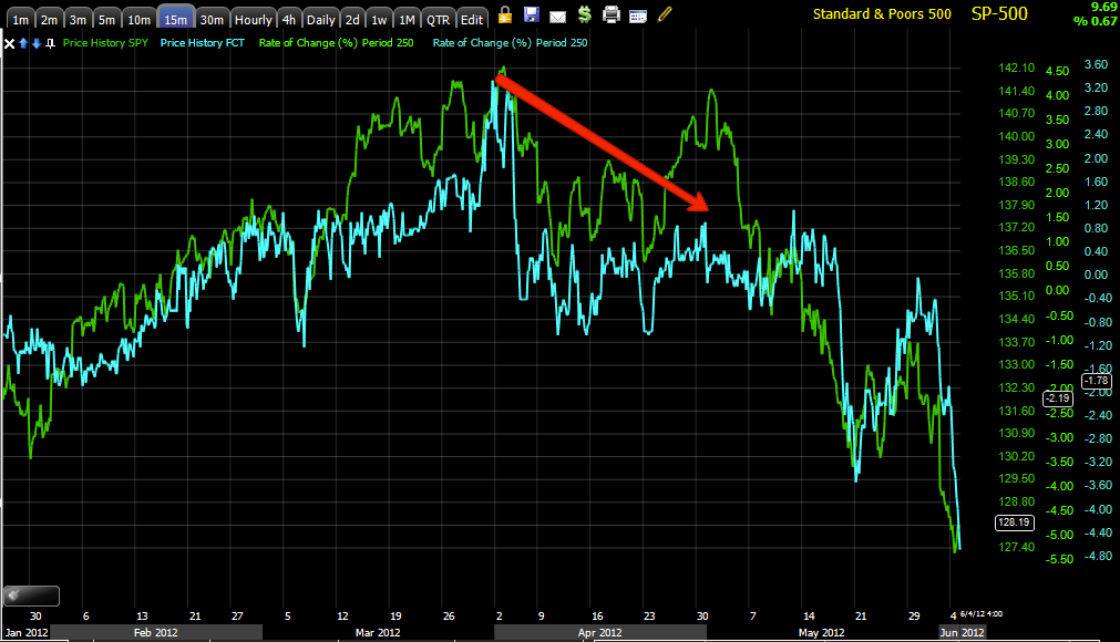
So today's massive move in FCT probably shouldn't be ignored and as far a it being a 1-day move, I again encourage you to read last night's "Minutes" post.
High Yield Corporate Credit... HYG (This is a very liquid asset and is a good leading indicator among credit assets).


Junk Credit is similarly negatively divergent with the SPX which is not a good signal as it is high yield and a choice asset for a risk on position.
This is the $AUD (Australian Dollar, a measure of the Carry trade and therefore a measure of what hedge funds are doing in the market, positive correlations are good for the market, negative correlations/divergences are generally warning signs).


As for more specific Carry Trade (which is what Hedge Funds and others use as cheap money to finance higher yielding assets like stocks), the currency pair of AUD/JPY.


Here's the same carry trade FX pair, note the June low, the same as the market, but notice how the carry trade has already been taken off and is below its 22 day moving average.
Finally the old Dow Theory standby, Transports
The last time we saw a significant divergence between the market and transports was all the way back to the 2007 market top and we know that didn't end well.
I'm not trying to justify an opinion, I'm simply showing you the charts that you've seen so many times before in numerous situations. Is a decline possible? We've already seen one since QE3 was announced, Goldman Sachs has their 2012 year end SPX target over 200 points lower and they are well aware of QE3.
While the probabilities between all of our analysis including: the 3C charts which seem to be very clear both in the market averages, individual stocks, Industry groups and the Futures; the breadth analysis; leading indicators and general market behavior seem to give us a probability and we'll look for the opportunities within the probabilities and elsewhere as the market does seem bifurcated more than ever, I want to assure you that if the data changes, so does the analysis. I don't care which way probabilities are, as long as we are on the right side of them.
Finally, someone did take the quick Gold/GLD short from yesterday and is in the green, glad to hear it!
Have a great weekend, I'll update as events and analysis warrant.


No comments:
Post a Comment