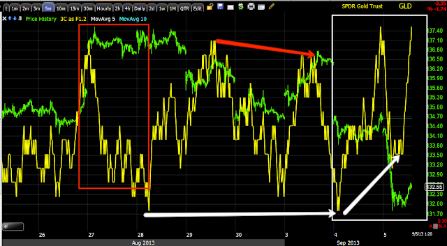
I'm not going to go in to all timeframes with gold, I'll just say that beyond what you see below which ends with a 10 min positive, at 15 mins GLD is nearly perfectly in line so that seems to be the transition point from short term trade to longer term trade as the 60 min chart is solidly negative.
SLV has some of the same signals, however at this time I have less interest in SLV.
YG/ 15 min Gold Futures with a large relative positive divergence, in yellow I don't like the parabolic dip in gold futures, it's either a head fake move which I think it is and/or it may need a reversal process rather than a "V" shaped run straight up from this area, meaning GLD might have to move sideways a bit to get a decent toe-hold to take off from. On the other hand a head fake/stop run already has a base and can reverse quite quickly. My decision on whether or not to get involved with gold / GLD will likely have more to do with whether I see a stronger base and stronger positive divergences in to that base which can all occur with the time we have left today.
This sharp 1 min positive in gold futures looks to me exactly like a stop run that was accumulated, even volume shot up as it should when stops get tagged.
This is GLD (red) vs the SPY, you can see recent behavior shows an inverse relationship as in, "Gold is acting as a flight to safety trade".
This is the trend of the 1 min chart over the last several days, it has been positive recently
This is the same chart intraday, there's accumulation at the lows and as price moves up some"steering" distribution, usually meant to bring prices back down to an accumulation zone at a lower level.
The negative divergence at the left is just for study, it's a relative negative and I drew it in so you could see why, but the main feature is the leading positive as GLD moved below recent support, or a stop run. That looks like a lot of stops were accumulated quickly. It's not like there isn't good reason...
This would be an hourly chart showing the stops hit, volume is quite large, thus the divergence would be quite large. This is covered in the two "Understanding the Head Fake Move" articles on the members' site, these are a must read in my opinion if you want to understand the market beyond the dogma of Technical Analysis.
5 min chart from a relative positive to a sharp leading positive at the stop run.
GLD is positive to about this 10 min chart, 15 min is in line and thus the transition chart, 60 min is negative.
I'll let you know if I decide to enter, I have no problem with the divergences as they are strong, I'd just like to see a wider foot print on the base, although the point of that is so enough shares can be accumulated, with such a large stop run, that may be a moot point.
Is interest rates about to start going up?
-
Yes, I know - it does not make any sense - FED is about to cut
rates...but....real world interest rates are not always what FED wants it
to be.
6 years ago


No comments:
Post a Comment