I was starting simply with an intraday market update, but some of the deterioration over the last 2-days, especially with the miss of Dow 17k , almost as if someone didn't want to encourage more speculative stock buying activity (someone who'd have the power to move the Dow down 1.3 point/s from 17k like the NY F_E_D's open market's desk) demanded that I put some of these trends in to perspective.
Many have asked about "Blow-off tops", it's hard to look at some of these charts and say that the move above SPX's 3 month range doesn't look a lot like a blow-off top, not only in 3C, but in price's ROC taken with everything else like forward earnings, manufacturing misses, global economic indicators hitting all time lows, etc.
*I've had to reduce the number of charts which paint a clear picture for the sake of time, there are too many assets that need to be monitored for a post this large during the trading day,
but the point of me capturing and intending to post all of these is to show the deterioration and in context of the broader trends already in place, I'll try to retain as much of that as I can with fewer charts.
SPY intraday deterioration since Yellen started her lecture. This is a trend in the averages.
Here's the Flag in the SPY, more distorted because of Bullard's, "Market is wrong" comments pre-market on the 26th, the accumulation there is a stick save of the flag, as I often say, "When Wall St. starts a cycle or a price pattern for whatever reason, they rarely let it fail".
Deterioration on a 5 min chart is pretty extreme vs. previous divergences that have sent the market lower to the left (a weak relative negative on the 24th), also the deterioration is almost EXACTLY where the Dow failed , again as if the invisible hand of the NY F_E_D's trading desk took action to make sure Dow 17k wasn't hit.
10 min chart shows the underlying trend more clearly with less noise, the
flag seems to have had one purpose and one purpose only, to use it to sell/short in to.
Looking at a SPY 10 min to the left is the strong accumulation of late January/early February that created the February rally which turned in to a 3 month trend with the SPX having a range of about 3%, the breakout above that range which we expected and noted in early and mid May as it was such obvious resistance has seen nothing but large leading negative divegrences, if you are looking for a potential blow-off top, we may have just went through it.
3C is at new leading negative lows.
30 min chart shows the same theme with the range in yellow.
it's hard to see because of scaling, but intraday the DIA has deteriorated.
DIA 2 min, Love these charts showing clear confirmation and no divergences as a price trend is confirmed, they are almost calibrated so the move in the DIA which would be a head fake move in almost every other average above the flag-like price pattern, shows ZERO confirmation which is what we look for in confirming a head fake move as they are used to trap bulls, distribute which includes short selling.
10 min deterioration since the Dow missed 17k
15 min chart shows a pattern oof distribution creating a resistance zone, I'm especially surprised this hasn't been head faked with 17k just above and obvious resistance, it makes a perfect head fake set up.
DIA 15 min trend
QQQ which has had the closest thing to confirmation intraday is seeing rtrouble right as Yellen began her lecture at 11 a.m.
2 min QQQ
Much stronger 15 min also starting a negative turn, Yellen again seems to be the catalyst.
QQQ 60 min overall trend with the Feb. rally and the QQQ and IWM being the 2 averages that retraced the entire rally on a negative divegrence just before the range developed, note the 60 min 3C chart as there's a breakout above the range, this is why shorter term charts/timing are very important against the backdrop of this longer term, higher probability divergence.
IWM has actually seen some of the worst underlying behavior, that seems like an oxy-moron as it has seen some of the best price gains, but smart money needs demand to sell in to so if you look at it from a TA textbook point of view it doesn't make sense, if you look at it from a supply/demand balance it makes perfect sense.
2 min IWM as confirmation
This closer view of the 2 min is where I see a potential IWM bounce intraday trying to get together, I'll keep an eye on it and see if it is tradable or if it's just a consolidation or is run over.
And the 15 min since the flag and what I'd expect to be a head fake move above the flag-like price action, the longer term 4C charts don't have as much detail, but trends are much clearer.
The 60 min view, just like all of the other averages since the break above the 3 month range, thus a potential blow-off top being used as such . You can't forget about numerous top patterns in popular stocks as this is taking place, the falling 10 year rate trend since the F_O_M_C, the spike in SKEW as OTM puts see their premiums rise as someone is buying them up in large supply, obviously they are worthless unless the market sees a crash.
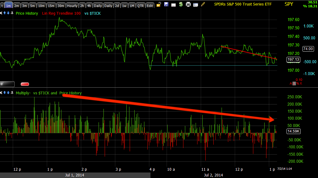
The cumulative effect on my custom TICK indicator is continued deterioration, the actual TICK is still in a mild zone of +/-750, essentially the market components are almost evenly weighted when taking a cursory look, however above you can see there's clear deterioration cumulatively.


No comments:
Post a Comment