There's still an intraday IWM divergence brewing, but I'll cover that later. For now SCTY, even Z are already at small gains and the NFLX put has cut it's loss from this morning in half and is very much within reasonable limits for the position. When you see so many shorts lining up at the same time, it's like that old, very time consuming way of measuring the market by looking at hundreds of stocks a night, but it was effective.
In any case, here's the Z charts, the reversal process is my major concern and why it's a partial position, but other than that, I like what I'm seeing.
I'm just guessing, but I think it's reasonable to assume higher rates would have a detrimental effect to a company like Zillow.
This is where I usually start, on a 5-day chart to gather in information about the character of the stock, where it is in the 4 stages, etc and what I notice here is a very pronounced increased rate of change, in fact a parabolic price move and I never trust them whether they are up or down, they tend to end badly.
A closer look at the weekly shows several reversal candlesticks and how increased volume increases the probabilities of these becoming effective reversals, remember they don't give any forecast on the size of the reversal, but a weekly reversal candle should see at least a week of reversal.
The Doji Star we have currently is a loss of momentum, a balancing of supply and demand whereas before, demand was outstripping supply, this is an indecision candle and just like anything that loses momentum like a ball thrown up in the air, there's a high probability of a reversal at that point.
On a daily chart you can see the former trend line and the increased ROC break-away, I often say these increased ROC break-away's are "seemingly" bullish, but between EVERY stage (1 base, 2 mark up, 3 top and 4 decline, there's always a change in the ROC of price just before entering the next stage.
I mentioned a stop above recent intraday highs, I prefer something wider, but even with a tighter stop of $145.75, you still have a position risk of only 4.2% which is well below the norm most traders use of 7-8% which I find totally arbitrary as each stock has much different beta so one percentage stop doesn't fit all. This can still be position sized so it only represents 1 or 2% loss of portfolio if it is stopped out, again that's via position sizing which is a handy little calculator I have created for the new site, giving you both the maximum share allotment for the 2% rule as well as for your own maximum position size, mine tend to run around 15-20% of portfolio (total position size of a trade).
The last several day's daily candles also have higher wicks which is a bearish sign of a rejection of higher prices intraday.
As for my Demark-inspired custom Buy/Sell indicator, it has given 4 sell signals in Z, each has been virtually right on, the current one is much larger and I do find that has a correlation to the size of the reversal.
I don't show this often, but do look at my MACD Heat Map, you can see the faster blue has gone in to a negative divegrence while the longer term Red/Yellow are very large, typically very bearish with a small blue or negative blue reading within them.
As for the 3C charts...
The 60 min overall underlying trend is where the highest probability resolution is, it has been negative which would suggest distribution in to the increased ROC which is often the case as stage 2 ends and moves to stage 3, however the even more negative recent downturn to a new leading negative low deserves some attention.
The 15 min chart in line with price and even showing a positive divegrence at a dip in price, after that it looks like pure distribution in to the following price trend. If an institutional entity hasn't moved their entire position and you have price turning down as it was at the divergence, it's not uncommon and often seen by market makers and specialists to create enough demand to get the trend back on track to finish the job.
The 10 min chart shows the exact same thing which is why I like to use multiple timeframe confirmation and multiple asset confirmation.
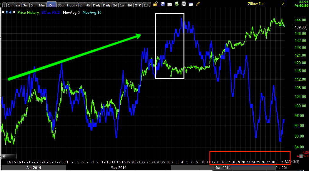
As far as timing, it has been intraday charts I've been watching for our member in Z, this 3 min has gone negative and over the same period as the flag which seems to have been used exclusively as a distribution zone as seen in charts of the averages so the fact that we see the exact same signal on the exact same days starting at the 25th tells me something not only about Z, but confirms suspicions about the market in general.
And finally 1 min intraday going negative at both intraday highs, thus forming the longer wick daily candles as intraday highs were distributed.
The only thing I'm not crazy about is the lack of a reversal process, but I can give a little slack because of the parabolic price trend.


No comments:
Post a Comment