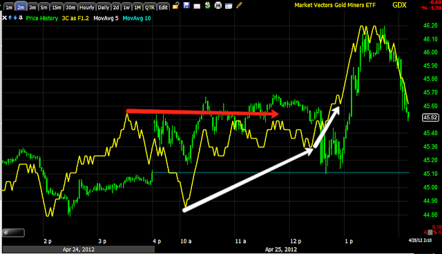
Since GDX and GDXJ have near term correlation with GLD, lets take a look...
GDX looks almost exactly like GLD on the 1 min.
Very similar on the 2 min as well
And the 3 min
The 5 min chart is nearly in line, although the negative divergence JUST BEFORE the policy statement, is clear.
Interestingly, the 30 min chart has a very strong positive divergence
As does the 60 min chart
GDXJ looks exactly the same on all of the charts, so I'm just showing the 60 min chart.
This is just a guess, but the longer term positive divergence suggests GDX/J move higher, that means GLD should move higher. In this case, that should be a reflection of dumb money QE3 expectations. This would move the market higher near term, maybe SPX $1400 as we had originally hoped on April 10th.
Is interest rates about to start going up?
-
Yes, I know - it does not make any sense - FED is about to cut
rates...but....real world interest rates are not always what FED wants it
to be.
6 years ago


No comments:
Post a Comment