I hate to jump to longer term or bigger picture conclusions based on very early data, especially with such an important bigger picture (market reversal), but there are several things (which include damage done last week) that are raising some alerts (rather than alarm).
Commodities and credit aren't performing all that well right now, but this isn't what is really catching my attention. What is more important are the configuration of the signals in multiple averages and timeframes. This still doesn't change how I feel about short term long trades from Friday like TECL as this doesn't mean there's an immediate break starting now, but the way the signals are moving are like a much faster tide that is clearly moving out.
Here are some examples of what I mean, please keep in mind the damage already done last week as well as the longer term damage done throughout the entirety of trend #1.
Damage done last week-DIA 10 min...
Trend 1 overall damage/tone on a DIA 60 min chart...
Although this is a very short term chart, it's the example it provides showing the difference between the character of even short term trade last week vs what we are already seeing this week.
Instead of just going negative or even showing a series of negatives which is bearish enough for underlying trade, this looks more like "Climbing in agony".
Here are some more examples, this seems to be more recent.
While many of you who are familiar with the types of divergences would probably look at these and think,
"They're leading negative divergences, What"s different about them?"
They have a loo of climbing in agony or something like trying to climb up a sand dune with the sand continually slipping out from under you. Most negative divergences see selling in to highs or the stronger ones will lead in to highs or price strength, I suppose it's not so much the divergence that's different as it is the way price looks, again, as if it is in agony trying to scale a slipping sand dune.
Why is this notable or important? Any change in character that stands out is always notable as changes in character lead to changes in trends.
Here the QQQ showed something similar last week when it finally broke above resistance highs that other averages had broken above a week earlier, it was quickly sold in to, this is similar to what we are seeing now.
The SPY on a 5 min chart shows multiple negative divergences, some pulling price back more than others, but there's the start of this feel on this chart as well.
Even on a 10 min chart there's a slight flavor of the same, although the more notable charts are earlier ones mostly from today.
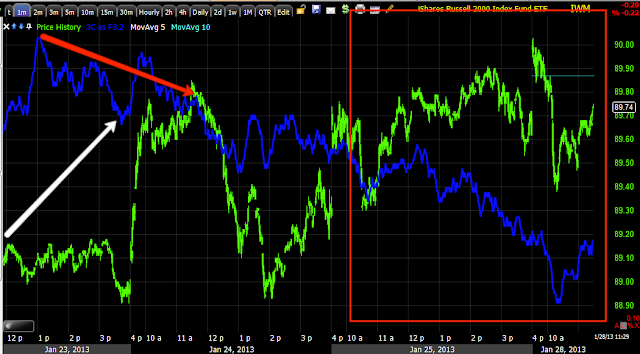
IWM 1 min positive that is sold in to immediately last week is definitely a negative sign, but it differs from what we are seeing today.
IWM 3 min is a leading negative divergence, yet again this is probably more about how price is reacting within a leading negative divergence than any real change in 3C, but it is a change of character.
Again, it's early and I don't want to jump to conclusions, but I also don't want to miss a key signal as each market has its own personality.
Is interest rates about to start going up?
-
Yes, I know - it does not make any sense - FED is about to cut
rates...but....real world interest rates are not always what FED wants it
to be.
6 years ago


No comments:
Post a Comment